
// Creative Agency
Pricing Page Design: 7 Best Practices for 2026

A good pricing page answers three questions fast: what do I get, what does it cost, and which plan is mine. The best pricing page designs use a simple layout, a small number of identical plan cards, a comparison table below them, and one clear next step. Everything else on this page is detail on how to build that, and where the common mistakes hide.
This guide is written for business owners and decision-makers who are building or redesigning a site. You don’t need to be a designer. You need to know what to ask for, what to check, and what to cut.
TL;DR
- Lead with value, then price: a clear headline, short plan descriptions and prices stated plainly, with the billing period next to the number.
- Keep to three or four plans, give every plan card the same structure, and put a full comparison table below the cards.
- Design the mobile version as a sequence of plans, not a shrunken desktop table, and restate the price on every card.
- Remove doubt near the button: refund terms, testimonials tied to a plan, security badges and an FAQ.
- Use one specific, verb-led call to action per plan, and highlight the plan most buyers should pick.
Table of Contents
- What a pricing page has to do
- 7 pricing page design best practices for 2026
- Pricing page layout: a section-by-section blueprint
- Pricing page design for mobile
- Pricing page examples: patterns worth borrowing
- A short checklist before you publish
- Where a web team fits in
- Our perspective on pricing pages
- FAQ
- Sources
What a pricing page has to do
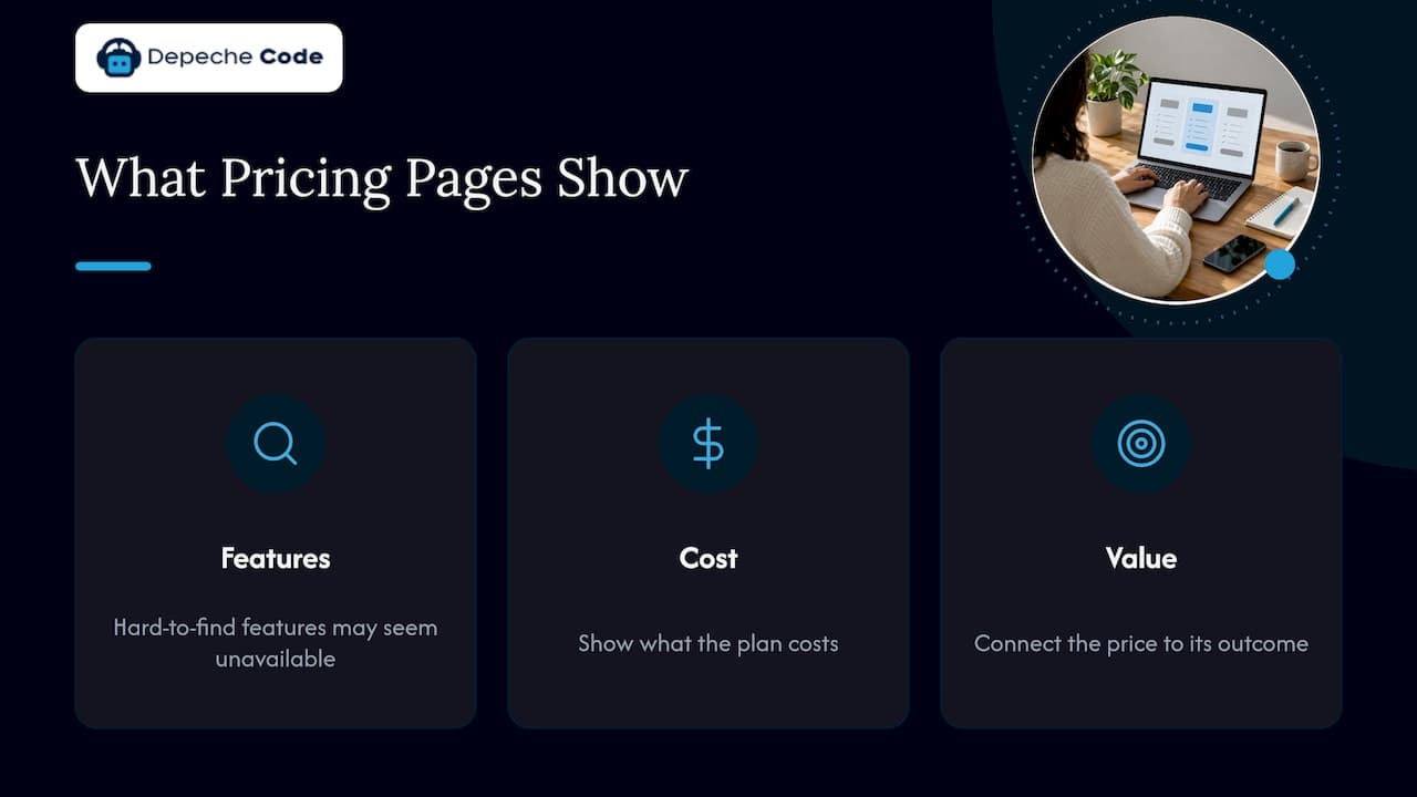
Visitors rarely land on a pricing page to be persuaded. They land to check a fact. Research from the Baymard Institute on plan comparison pages found that people often arrive with specific feature requirements, and if they can’t quickly find a feature, they tend to assume it isn’t offered and leave. That is the whole job of the page: make the facts easy to find so the visitor stays long enough to choose.
Figma’s guide to pricing pages puts the same idea simply: the most effective pages tell customers what they get, what it costs and why it’s worth it. Notice the third part. A price alone is a number. A price next to the outcome it buys is a decision.
One caveat before the list. Not every business can or should publish a flat price for every service. Custom web projects, SEO retainers and app builds often depend on scope. The principles below still apply: you can publish starting points, packages or ranges, explain what moves the price, and make the next step obvious. If you are still working out how to structure your own pricing, our guide to the website pricing model walks through the options.
7 pricing page design best practices for 2026
1. Open with a value headline, not a price list
The sample layout in Figma’s guide starts with a value-focused headline, short plan descriptions, pricing cards, trust signals, a comparison table, FAQs and a sticky call to action. That order is worth copying. The headline tells the visitor they are in the right place. The short descriptions tell each type of buyer which plan is theirs.
Write the headline about the result: “Plans that grow with your team” beats “Pricing.” Then give each plan one sentence naming who it is for, such as “For a single location” or “For teams running several campaigns.” Avoid internal jargon in plan names. A visitor who has to decode “Tier 2” has already started to doubt.
2. Limit the number of plans
Figma recommends around three to four tiers to avoid analysis paralysis. Smashing Magazine’s UX writing on pricing plans makes the same point from the user side: more options mean more time spent deciding, and some visitors give up instead.
Three plans is a safe default. It gives a starter option, a middle option and a top option, which lets you make one of them the obvious pick. If you have more offers than that, group them by need (for example, “for new businesses” and “for established businesses”) or move the custom option to a “talk to us” card rather than a fourth column.
3. Make every plan card identical in structure
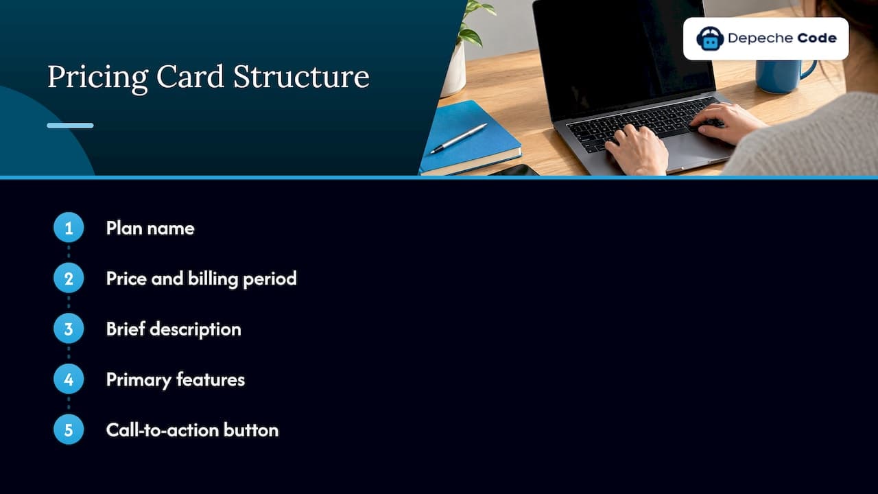
Visitors compare by scanning sideways. That only works when each card follows the same internal order. WireframeTool’s design guide says each card should hold the plan name, price and billing period, a brief description, a bulleted list of primary features and a call-to-action button in that sequence, so the eye can move across the cards without re-learning the layout.
A quick audit you can do today: cover the plan names and check that you can still tell which part of each card is the price, which is the description and which is the button. If you can’t, the structure is inconsistent.
4. State the price completely, with no surprises
Figma’s guidance is blunt: state costs clearly, avoid hidden fees and surprise add-ons, use whole numbers, and put whether the cost is per month, per user or per unit near the price. If you offer a discount for annual payment, use a monthly and annual toggle and show the annual savings clearly.
Two habits cause most of the trouble here:
- Footnotes and asterisks. GazeSite argues that asterisks undermine trust and that a limit should be written in the cell itself, for example “Up to 50 projects.” If a limit matters to the decision, it belongs in plain sight.
- Setup fees tucked below the fold. If there is a one-time fee on top of a monthly price, show both next to each other. A visitor who finds the fee later feels misled, whatever the total is.
If your work is quoted per project, the same logic holds. Say what the price depends on (pages, integrations, content, timeline) so a visitor can estimate before they call. Our website cost breakdown shows how those factors add up in practice.
5. Build a comparison table people can actually read
Below the cards, add a full feature comparison. WireframeTool’s guide recommends feature categories as row groups, individual features as rows, plans as columns, with checkmarks or specific values, and a sticky header that keeps plan names visible while scrolling.
Smashing Magazine describes how people read these tables: the “lawn mower” pattern. Eyes start in the top-left cell, run to the end of the row, drop down, and run back, now and then jumping to study one attribute and returning to the headers to confirm which plan they are in. Three design rules follow from that:
- Keep the same rows in the same order for every plan.
- Keep plan names pinned at the top while the visitor scrolls.
- Group related features and let visitors expand detail on tap or click instead of relying on hover tooltips.
Rework’s 2026 guide adds a simple visual convention: green checkmarks for what is included and gray dashes for what is not. It sounds minor, but it lets a visitor read yes or no without reading words.
6. Put trust signals next to the decision
A buyer about to commit money looks for reasons to relax. Rework recommends placing customer logos, testimonials tied to specific plans, security badges and money-back guarantees near the call to action. LogRocket makes a similar point about refunds, suggesting you state the refund policy on the pricing page itself, such as a 30-day money-back guarantee.
Only use signals that are true for you. A testimonial from a customer on the plan being viewed is stronger than a generic wall of logos, because it answers “will this work for someone like me?” Add a short FAQ at the bottom for the questions that otherwise become sales emails: contracts, cancellation, what is included in support, what happens when needs grow.
7. Give each plan one specific next step
A button reading “Submit” tells the visitor nothing. Write the action and the outcome: “Start the project,” “Get my quote,” “Book a planning call.” Make the button big enough to find without searching and keep the same wording logic across plans, changing only what truly differs. Also highlight the plan most buyers should choose with a label such as “Most popular” or “Recommended”, so the decision feels guided.
Figma’s sample layout includes a sticky call to action, which keeps the next step in view as the visitor scrolls through the comparison table. For a service business, a sticky “Talk to us” bar does the same job for visitors who need a custom quote.
Pricing page layout: a section-by-section blueprint
If you want a layout to hand to a designer, use this order. It combines the Figma sample layout with the layout guidance above.
| Order | Section | What it holds | Why it is there |
|---|---|---|---|
| 1 | Hero | Value headline, one-line subhead | Confirms the visitor is in the right place |
| 2 | Plan cards | 3 to 4 identical cards: name, price and period, description, key features, button | Lets visitors compare at a glance |
| 3 | Billing toggle | Monthly and annual, with savings shown | Answers the cost question in one click |
| 4 | Trust signals | Plan-specific testimonials, badges, refund terms | Lowers the anxiety right before the button |
| 5 | Comparison table | Grouped rows, same order for every plan, sticky header | Serves visitors with specific feature needs |
| 6 | FAQ | Contracts, support, upgrades, cancellation | Answers objections without a sales call |
| 7 | Closing call to action | One clear next step | Catches visitors who read to the end |
The goal for the top of the page is speed. Pricing consultant Rob Litterst’s guide says the visitor should grasp how your pricing works in under a minute, ideally within 30 seconds. Use that as a test: show the page to someone outside your company, start a timer, and ask what the cheapest plan costs and which plan includes a specific feature. If they can’t answer in 30 seconds, simplify.
Pricing page design for mobile
A large share of visitors will see your pricing on a phone, and a desktop table squeezed onto a small screen fails them. The usual patterns are:
- Stack the plans vertically. Each plan becomes a full card, one under the other. Rework recommends stacking plans vertically on mobile to keep the page scannable, and it works best with four or fewer plans.
- Swipeable cards. Plans sit side by side and the visitor swipes. If you use this, show a sliver of the next card so people know there is more.
- Collapse the detail. LogRocket suggests progressive disclosure, showing the relevant information first and letting the visitor open the rest, rather than showing everything at once on a small screen.
GazeSite makes the sharpest point about mobile: a three-column table is not a real comparison on a phone, because the reader sees one tier, scrolls, and by the next tier has forgotten the first. Its advice is to treat the mobile page as a sequence, where each tier restates its price and its headline difference. Practically, that means repeating the price and billing period on every card, and starting each card with what is new compared with the one before it.
Smashing Magazine also advises against horizontal scrolling on mobile and against hover tooltips, since there is no hover on a touchscreen. Use tap-to-reveal instead.
When you test, don’t just resize a browser window. Pick up a phone, open the page on cellular data and try to answer the same two questions: what does the cheapest plan cost, and what do I get on the middle plan? Slow loading is part of pricing page design too. A page that takes several seconds to show its numbers loses people before the layout matters.
Pricing page examples: patterns worth borrowing
Rather than copying one company’s page, borrow the patterns that show up again and again in strong pricing pages:
- A highlighted plan. One card is visually singled out, usually the middle one, with a label. It gives buyers a default so they don’t have to evaluate every option from scratch.
- Additive upgrade copy. Higher plans start with a line like “Everything in the previous plan, plus:”. It frames an upgrade as a gain and shortens the feature list on each card.
- Increasing feature counts per plan. Cards show a few headline features each, and the number grows as the price grows, so the step up is visible.
- Color-coded or labeled plans. A distinct color per plan helps people keep track of where they are when they scroll to the comparison table.
- Savings shown in dollars. Showing what annual billing saves in actual dollars is usually clearer than only showing a percentage.
- Pricing visible without scrolling. Great pages let a visitor see what it will cost them without scrolling or clicking.
For a service business, one pattern matters more than the rest: packages. Instead of a blank “contact us for a quote,” show two or three named packages with a starting price and a plain description of what is included, plus a custom option for unusual projects. Visitors who can see a starting point are far more likely to reach out than those who face a blank form.
A short checklist before you publish
Run your draft through these points. Each one traces back to the guidance above.
- Does the headline say what the visitor gets, not just “Pricing”?
- Are there three or four plans, not six?
- Does every card follow the same order, with the billing period next to the price?
- Is every limit and fee written in plain sight, with no asterisks?
- Is there a comparison table with a sticky header and the same rows for each plan?
- Do trust signals sit near the button, and are they all true?
- Does each button say a specific action?
- Does the mobile version restate the price on every card and avoid sideways scrolling?
- Can a stranger answer two pricing questions in 30 seconds?
Where a web team fits in
A pricing page is a design, copy and engineering task at once. The cards, sticky comparison table, annual toggle and mobile behavior all have to work together, load quickly and match the rest of your site. If your current page is a dense table that nobody reads, a redesign of the page, or of the whole site around it, is usually the quickest fix.
Depeche Code is an Orlando-based agency that builds and redesigns business websites. Our approach to delivery is to direct AI in-house to move projects along faster, we state that you own everything we deliver, and we measure technical performance with Google PageSpeed and SEO scores. If you want a pricing page, or a full site, built to the layout above, see our website design and redesign services.
If you are comparing providers before you commit, our guide to matching an agency to two or three outcomes helps you set the brief first, and the full list of what we do is on our services page.
Our perspective on pricing pages
Most pricing pages we are asked to fix have the same root problem: they were designed to look impressive, not to answer a question. The visitor arrives with one doubt, usually “is this within my budget?” or “does this include what I need?”, and the page makes them hunt for the answer.
We build pricing pages the way we build everything else for clients: start from the decision the visitor has to make, then remove everything that slows it down. That means a small number of clear plans, honest prices with the billing period beside them, and a mobile layout that works as a sequence rather than a shrunken table. It also means the page has to load fast, which is why we check technical performance with Google PageSpeed and SEO scores rather than guesses.
Pricing is also part of the wider site. A strong pricing page sends people to a clear next step, whether that is a quote request or a chat with an assistant, and it supports the pages that bring visitors in through search. When we redesign a site, the pricing page is one of the first places we look, because a small improvement there is felt in every sales conversation that follows.
You own what we deliver, and that includes the design of your pricing page. We think a page that explains your value plainly is the cheapest sales rep a business can have.
Donovan Wells - Founder and CEO
FAQ
What is the best design for a pricing page?
The best design is the simplest one that answers what you get, what it costs and why it is worth it. In practice that means three or four identical plan cards, one highlighted plan, a comparison table below, trust signals near the button and a short FAQ. Test it by asking a stranger to find the price of a plan within 30 seconds.
How many pricing plans should I show?
Three is a safe default and four is usually the ceiling. Figma’s guidance recommends around three to four tiers to avoid analysis paralysis. If you have more offers, group them by buyer type or move custom work to a “talk to us” option.
Should I show prices if my services are custom?
Yes, show what you can. A starting price, a named package or a range tells visitors whether you fit their budget, and an explanation of what changes the price helps them estimate their own. Add a custom quote option for projects that fall outside the packages. Our website cost breakdown shows the factors that usually move a web project’s price.
How should a pricing page work on mobile?
Stack the plans vertically or use swipeable cards with a visible edge, and restate the price and main difference on every card. Avoid horizontal scrolling and hover tooltips, and let visitors expand feature lists on tap. The mobile pricing guidance from GazeSite treats the mobile page as a sequence of tiers rather than a table.
Do I need a monthly and annual toggle?
If you bill both ways, yes. A toggle lets visitors see the cost they care about without leaving the page, and Figma recommends showing annual savings clearly. If you only bill one way, skip it and state the billing period beside the price.
Sources
- Pricing Page Best Practices + Examples, Figma
- 79 Plan Matrix Design Examples, Baymard Institute
- Wireframe Pricing Page Design Guide, WireframeTool
- Designing Effective Pricing Plans UX, Smashing Magazine
- Readable Pricing Tables People Can Parse Fast, GazeSite
- Designing your pricing page with data-driven decisions, LogRocket
- Pricing Page Optimization, Rework
- The Ultimate Guide to SaaS Pricing Pages, PricingSaaS