

TL;DR:
- A mobile layout redesign prioritizes content structure and interaction for smartphones and tablets. It improves load speed, call-to-action visibility, and accessibility, which boosts search rankings and conversions. Regular testing on real devices ensures ongoing performance and user experience improvements.
Mobile layout redesign is the process of rebuilding a website’s structure specifically for smartphone and tablet users, not just shrinking a desktop version to fit a smaller screen. Mobile devices now account for more than 60% of global web traffic, making the mobile experience your primary customer touchpoint. A poorly structured mobile layout buries calls to action, slows load times, and signals low quality to Google’s ranking algorithm. Understanding why mobile layout redesign matters is the first step toward fixing the real problems that cost you conversions every day.
Why mobile layout redesign matters more than responsive design
Most business owners assume that a responsive website solves their mobile problems. It does not. Responsive design adapts a desktop layout to different screen sizes, but it does not rethink the content order, button placement, or interaction patterns for mobile users. The result is a layout that technically fits a phone screen but still behaves like a desktop site.
Mobile-first design is the recognized industry standard for solving this. It means designing for the smallest screen first, then adding features for larger screens. This approach forces you to prioritize what matters most, because a 375-pixel-wide screen has no room for clutter.
The technical difference shows up in the CSS. Mobile-first CSS uses min-width media queries, which means mobile devices load only the styles they need. Desktop-first CSS loads everything and then overrides it for smaller screens, creating unnecessary weight and slower performance on phones.
Desktop-first responsive design frequently buries calls to action below the fold on mobile. That is not a styling problem. It is a structural one that requires a true redesign, not a tweak.
Pro Tip: Test your current site on a real phone, not just a browser’s device emulation tool. Emulators miss real-world touch behavior, font rendering, and load speed on cellular connections.
Key differences between responsive design and mobile-first redesign:
- Content order: Responsive design preserves desktop order; mobile-first redesign puts the most important content at the top for phone users.
- CSS loading: Mobile-first loads minimal styles first; desktop-first loads maximum styles and strips them back.
- CTA placement: Mobile-first keeps primary buttons above the fold by design; responsive layouts often push them down.
- Interaction design: Mobile-first accounts for touch targets and thumb zones from the start; responsive design retrofits them.
- Performance: Mobile-first pages load faster on cellular because they carry less initial CSS weight.
What common mobile layout issues hurt conversions and UX?
The most damaging mobile layout problems are structural, not cosmetic. They exist on sites that look fine on desktop but quietly destroy conversions on phones.
1. CTAs buried below the fold
41% of landing pages bury their primary call to action below the fold on mobile. That means a visitor has to scroll before they can even see the button you want them to click. Most will not scroll. They will leave.

2. Tap targets that are too small
35% of audited sites have tap targets smaller than the 44×44 pixel minimum recommended by accessibility guidelines. A button that is too small causes mis-taps, frustration, and lost clicks. This is not just a usability problem. It is an accessibility failure that affects users with motor impairments and older adults.
3. Slow load times on mobile
Mobile pages load slower than desktop pages by default. Mobile LCP averages 3.2 seconds compared to 2.1 seconds on desktop. Largest Contentful Paint, or LCP, is a Core Web Vitals metric that Google uses to evaluate page experience. A slow LCP raises bounce rates and drops search rankings.
4. Complex multi-column layouts
Desktop designs often use two or three columns to display content side by side. On a phone screen, those columns collapse into a confusing stack. Single-column layouts built for vertical scrolling improve reading flow and reduce cognitive load for mobile users.
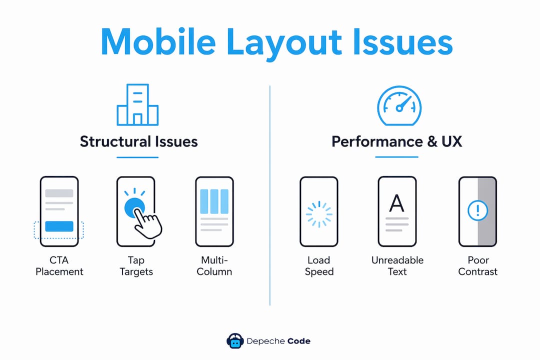
5. Unreadable text and poor contrast
Font sizes below 16px force users to pinch and zoom. Poor color contrast makes text hard to read in bright outdoor light. Both problems signal low quality and drive users away before they convert.
How does a mobile-first layout improve SEO and user engagement?
Google has used mobile-first indexing since 2018, meaning it evaluates and ranks your site based on its mobile version, not the desktop version. A site that performs well on desktop but poorly on mobile will rank lower, regardless of its content quality. This single fact makes mobile layout redesign a direct SEO investment.
Beyond rankings, mobile-first design changes how users engage with your content. A well-structured mobile layout keeps users on the page longer, reduces bounce rates, and guides them toward conversion actions more efficiently.
“Designing for mobile forces clarity and prioritization, resulting in interfaces that are simpler, faster, and more user-friendly across all devices.”
Progressive enhancement is the principle behind this approach. You build the core experience for mobile first, then layer in richer features for tablets and desktops. This means every user gets a functional, fast experience, and larger-screen users get additional enhancements on top.
The business benefits of a mobile-first layout include:
- Higher search rankings because Google indexes the mobile version of your site.
- Lower bounce rates because content loads faster and appears in the right order.
- Better conversion rates because CTAs are visible without scrolling.
- Improved accessibility because touch targets and font sizes meet standard guidelines.
- Future-proofing because the layout scales cleanly to new device types and screen sizes.
A mobile-first design approach also simplifies navigation. Hamburger menus, sticky headers, and thumb-friendly button placement reduce friction for users navigating with one hand on a moving train or in a waiting room.
What practical steps can businesses take to redesign mobile layouts?
A mobile layout redesign does not require rebuilding your entire website from scratch. It requires a structured audit and a clear set of priorities.
Audit your current mobile experience
Start by opening your site on three or four real devices with different screen sizes. Note every element that requires pinching, horizontal scrolling, or excessive vertical scrolling to reach. Use Google’s PageSpeed Insights to get your Core Web Vitals scores. These numbers tell you exactly where performance is failing.
Prioritize content hierarchy
Sort every element on each page into three categories: must show, should show, and can show. “Must show” content appears above the fold on mobile. “Should show” content appears within one scroll. “Can show” content lives at the bottom or behind a tap. This exercise forces you to make decisions that responsive design never required.
Fix CTA placement with CSS reorder or sticky elements
CSS-based reordering lets you change the visual order of elements on mobile without changing the HTML structure. A CTA that appears third in your desktop layout can appear first on mobile using CSS Flexbox order properties. Sticky CTAs, which stay fixed at the bottom of the screen as users scroll, are another proven method for keeping conversion buttons visible.
Meet accessibility tap target standards
Every button, link, and interactive element needs a minimum touch area of 44×44 pixels. If your current buttons are smaller, increase their padding rather than their font size. This preserves your visual design while meeting the accessibility standard required by WCAG guidelines.
| Layout element | Desktop approach | Mobile-first approach |
|---|---|---|
| CTA placement | Above fold on desktop, often below on mobile | Always above fold by design |
| Navigation | Horizontal menu bar | Hamburger or bottom tab bar |
| Images | Large hero images, full width | Compressed, modern formats (WebP) |
| Columns | Two or three columns | Single column, vertical scroll |
| Font size | 14–16px base | 16px minimum base |
| Tap targets | Click-sized (any size works) | 44x44px minimum |
Compress images and improve load speed
Compressing hero images and switching to modern formats like WebP can cut mobile load time by 1 to 1.5 seconds. That improvement directly raises your LCP score and reduces bounce rates. Lazy loading images below the fold means the browser only loads what the user actually sees.
Pro Tip: Use Google’s PageSpeed Insights and run it on your mobile URL specifically, not the desktop version. The mobile score is what Google uses for ranking, and it is almost always lower than the desktop score.
How do you evaluate the success of your mobile layout redesign?
Measuring the impact of a redesign requires tracking the right metrics before and after the changes go live. Without baseline data, you cannot prove improvement.
Track these metrics consistently:
- Conversion rate on mobile: The percentage of mobile visitors who complete your primary goal, whether that is a form submission, purchase, or phone call.
- Bounce rate by device: A high mobile bounce rate compared to desktop signals a layout or speed problem.
- Average session duration on mobile: Longer sessions indicate users are finding what they need and engaging with your content.
- Core Web Vitals scores: LCP, Cumulative Layout Shift (CLS), and Interaction to Next Paint (INP) are the three metrics Google uses to assess page experience.
- Google Search Console mobile usability report: This report flags specific mobile errors like text too small to read, clickable elements too close together, and content wider than the screen.
Run user testing on real devices with real people from your target audience. Watching someone navigate your site on a phone reveals problems that no analytics tool will catch. Iterate based on what you observe, not just what the data suggests. A redesign is not a one-time project. It is an ongoing process tied to how your users and their devices evolve.
Key Takeaways
Mobile layout redesign directly determines your search rankings, conversion rates, and user engagement on the platform that drives the majority of web traffic.
| Point | Details |
|---|---|
| Redesign beats responsive | True mobile-first redesign fixes CTA placement and interaction problems that responsive design cannot solve. |
| CTAs above the fold | 41% of landing pages bury primary CTAs on mobile, directly cutting conversion rates. |
| Google ranks mobile first | Mobile-first indexing means your mobile layout quality determines your search position. |
| Tap targets matter | Buttons smaller than 44x44px cause mis-taps and accessibility failures that drive users away. |
| Measure before and after | Track Core Web Vitals, bounce rate, and mobile conversion rate to prove redesign impact. |
What most businesses get wrong about mobile redesign
The most common mistake I see is treating mobile redesign as a visual project. Business owners look at their site on a phone, decide it “looks fine,” and move on. But looking fine and performing well are completely different things.
The real problems are structural. A CTA buried three scrolls down does not look broken. It just never gets clicked. A button that is 30 pixels tall does not look wrong to the eye. It just gets mis-tapped constantly. These are invisible failures, and they compound over time into significant revenue loss.
The second mistake is skipping user testing on actual devices. I have seen sites that scored well on emulators and fell apart on a real Android phone with a cellular connection. Emulators do not replicate real-world conditions. Real users on real devices reveal the truth.
The third mistake is treating redesign as a one-time event. Mobile usage patterns, device capabilities, and Google’s ranking criteria all change. A layout that performs well today may need adjustment in 12 months. The businesses that win on mobile treat it as a continuous discipline, not a checkbox.
If you are a business owner or webmaster reading this, the most valuable thing you can do today is open your site on your own phone and try to complete the action you want your customers to complete. Time how long it takes. Count how many scrolls it requires. That experience is exactly what your customers face every day.
— Donovan
Depechecode builds mobile-first websites that convert
Depechecode is a full-service digital agency based in Orlando, and mobile-first design is central to every website project the team delivers. If your current site buries CTAs, loads slowly on phones, or fails Google’s Core Web Vitals, a professional redesign addresses all three problems at once.
Depechecode’s website design and development service covers mobile layout architecture, performance optimization, accessibility compliance, and SEO alignment from the ground up. Every site is built to rank on Google’s mobile-first index and convert the visitors it earns. Business owners who want a site that works as hard on a phone as it does on a desktop can also explore SEO options and plans to pair technical redesign with ongoing search visibility.
FAQ
Why does mobile layout redesign affect SEO?
Google has used mobile-first indexing since 2018, meaning it ranks your site based on its mobile version. A poorly structured mobile layout directly lowers your search position.
What is the difference between responsive design and mobile-first redesign?
Responsive design adapts a desktop layout to smaller screens. Mobile-first redesign builds the layout for mobile first, then enhances it for larger screens, resulting in better performance and CTA visibility.
How small is too small for a mobile button?
Any tap target smaller than 44×44 pixels is below the accessibility standard. Research shows 35% of sites fail this threshold, causing mis-taps and user frustration.
How long does a mobile layout redesign take?
Timeline varies by site complexity and is not publicly standardized, but most professional redesigns for small business sites take between four and eight weeks from audit to launch.
What metrics prove a mobile redesign worked?
Track mobile conversion rate, bounce rate by device, Core Web Vitals scores (especially LCP), and the Google Search Console mobile usability report before and after the redesign.