

The most effective mobile optimization workflow runs in five ordered phases: Audit → Prioritize → Implement → QA → Monitor. Follow that sequence and you get measurable results fast, without burning dev hours on fixes that don’t move the needle.
Your success targets are concrete. Core Web Vitals thresholds set the bar at LCP under recommended thresholds of a few seconds, INP under recommended low interaction delay, and CLS under minimal layout shift. Hit all three and you’re in “good” territory for both Google rankings and user experience. Miss them and you’re losing visitors before they ever see your offer.
Here’s the high-level sequence this guide unpacks:
- Audit your current mobile performance with Lighthouse, PageSpeed Insights, and WebPageTest
- Prioritize fixes by impact × effort, scoped to your highest-value pages
- Implement responsive patterns, image strategies, and JS/CSS optimizations
- QA across a device matrix before every release
- Monitor with dashboards that separate mobile from desktop and alert on drops
Key Takeaways
A structured mobile optimization workflow, run in the sequence Audit → Prioritize → Implement → QA → Monitor, consistently produces faster load times, better Core Web Vitals scores, and measurable conversion gains on mobile.
| Point | Details |
|---|---|
| Audit before you build | Run Lighthouse, PageSpeed Insights, and WebPageTest on your highest-value pages before writing a single line of fix code. |
| Core Web Vitals are your gates | LCP under 2.5s, INP under recommended low interaction delay, and CLS under minimal layout shift thresholds are the pass/fail thresholds for every release. |
| Prioritize by business impact | Score fixes by impact × effort; a revenue-driving page with a score of 65 outranks a blog post with a score of 90. |
| QA on real devices | Always test on at least one low-end Android device; fixes that look perfect on an iPhone can break on 2GB RAM hardware. |
| Depechecode delivers the full workflow | Depechecode provides audit, prioritized roadmap, implementation, QA, and monitoring dashboard as a single engagement. |
Your one next step: Run a Lighthouse mobile audit on your top landing page right now. It takes under 5 minutes and will show you exactly which metric is costing you the most.
Table of Contents
- What is mobile optimization and why does it matter in 2026?
- How does a step-by-step mobile optimization workflow actually run?
- Which tools should you use for mobile testing and metrics?
- What mobile CRO tactics actually improve conversions?
- What does a solid QA checklist and rollout process look like?
- How long does mobile optimization take and what does it cost?
- How Depechecode implements this workflow for clients
- A practical perspective on what most teams get wrong
- Depechecode’s mobile audit and optimization service
- Sources
- FAQ
What is mobile optimization and why does it matter in 2026?
Mobile optimization is the practice of making a website fast, usable, and conversion-ready on phones and tablets. That covers three layers: technical performance (load speed, Core Web Vitals), responsive or mobile-first design (layout, touch targets, navigation), and conversion experience (CTAs, forms, checkout flows).

The business case is hard to argue with. Google’s mobile-first indexing means Google crawls and ranks your site based on its mobile version, not desktop. If your mobile content is thinner, slower, or less crawlable than your desktop version, your rankings suffer regardless of how polished your desktop experience is.
On the user side, the abandonment risk is real. Industry research consistently shows that many mobile visitors leave pages that take longer than about 3 seconds to load. A visitor who bounces in 2 seconds never becomes a lead.
The four pillars mobile optimization addresses:
- Performance: LCP, INP, CLS, and TTFB targets that keep users engaged
- Usability: Touch-friendly navigation, readable text without zooming, no horizontal scroll
- Discoverability: Mobile parity for content, structured data, and crawlable resources
- Conversion: CTA visibility, simplified forms, and frictionless checkout on small screens
Responsive design, fast load times, and mobile-first CTA placement are the highest-impact actions Google’s own guidance calls out for mobile usability and ad performance. That’s not a coincidence. Those three factors directly affect both organic rankings and paid campaign ROI.
How does a step-by-step mobile optimization workflow actually run?
This is the operational core. Each phase has a clear owner, a defined output, and acceptance criteria before the next phase starts.
Phase 1: Scope and discovery
Don’t try to optimize every page at once. Prioritize by template and business value: landing pages, product or category pages, contact forms, and checkout flows drive the most revenue. Fix those first, measure the impact, then scale to secondary templates.
Identify a few representative pages per template type. A homepage, a service page, a contact page, and a blog post cover most small-business sites. For e-commerce, add a product page and a cart/checkout page.
Phase 2: Audit
Run audits in this sequence to reduce diagnostic noise and keep fixes attributable:
- Lighthouse in Chrome DevTools (controlled lab test, mobile preset, throttled to “Slow 4G”): captures LCP, INP, CLS, FCP, and TTFB with a reproducible setup
- PageSpeed Insights (field + lab data from CrUX): shows how real users on real networks experience your pages
- WebPageTest (device/network diagnostics, filmstrip, waterfall): isolates render-blocking resources, third-party tag weight, and connection-level bottlenecks
A layered audit sequence running Lighthouse first, then PageSpeed Insights, then WebPageTest is the agency-recommended approach because each tool answers a different question. Lighthouse tells you what’s broken in a controlled environment. PageSpeed Insights tells you what real users are experiencing. WebPageTest tells you exactly where the waterfall breaks down.
Also run a manual device check. Load each priority page on a physical low-end Android device and a recent iPhone. Look for layout breaks, tap targets smaller than 44×44px, text that requires zooming, and pop-ups that block content.
Common failure modes to map during the audit:
- Uncompressed or oversized images (often the single biggest LCP killer)
- Render-blocking JavaScript or CSS loaded in the
<head> - Heavy third-party tag weight (chat widgets, analytics, ad pixels)
- Slow server response time (TTFB above 600ms)
- Layout shifts from images or embeds without declared dimensions
Phase 3: Prioritization
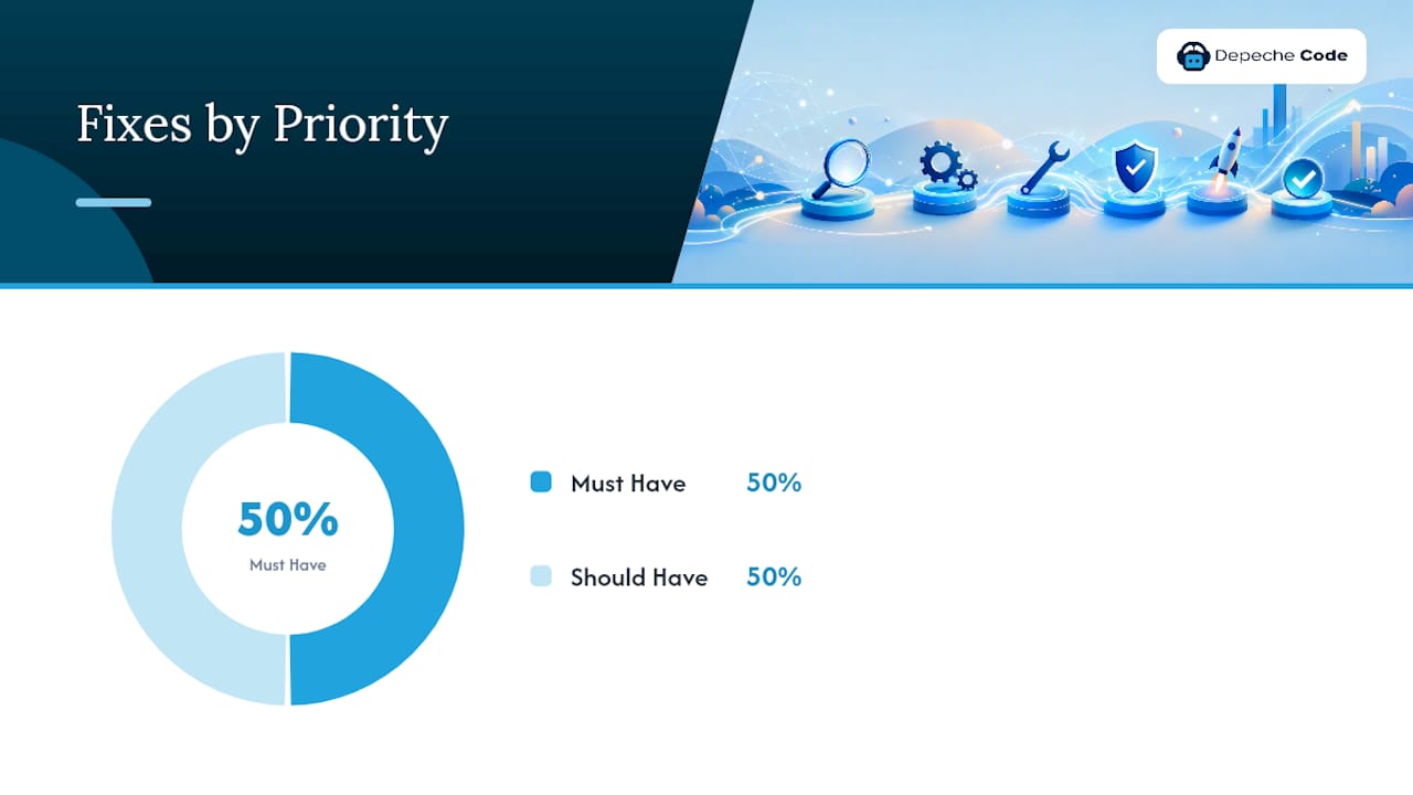
Score each fix using a simplified impact × effort matrix in your streamlining SaaS operations without adding overhead approach. RICE (Reach, Impact, Confidence, Effort) works well for teams with product managers. MoSCoW (Must Have, Should Have, Could Have, Won’t Have) works better for smaller teams moving fast.
| Fix | Business Impact | Dev Effort | Priority |
|---|---|---|---|
| Compress and serve images in WebP with srcset | High (LCP) | Low | Must Have |
| Defer non-critical JavaScript | High (INP, FCP) | Low–Medium | Must Have |
| Inline critical CSS | Medium (FCP) | Medium | Should Have |
| Replace third-party chat widget with lighter alternative | Medium (TTFB, INP) | Medium | Should Have |
| Implement lazy loading for below-fold images | Medium (LCP) | Low | Must Have |
| Rebuild checkout flow for single-page mobile UX | High (conversion) | High | Should Have |
Pro Tip: Run your audit before scoring anything. Teams that prioritize from gut feel routinely spend two weeks on CSS tweaks while a single uncompressed hero image is adding 4 seconds to LCP.
Phase 4: Implementation patterns
Responsive design with srcset and WebP images, minimized third-party scripts, and validated Core Web Vitals are the implementation pillars that move both rankings and conversions. Here’s how each plays out in practice:
- Images: Convert to WebP, add
srcsetfor multiple breakpoints, declarewidthandheightattributes to prevent layout shifts, and lazy-load everything below the fold - JavaScript: Defer non-critical scripts with
deferorasync; move analytics and tag manager calls below the fold where possible - CSS: Inline the critical CSS needed to render above-the-fold content; load the rest asynchronously
- Responsive layout: Use CSS Grid or Flexbox with fluid breakpoints; test at 320px, 375px, 390px, and 428px widths to cover the most common phone sizes
- Progressive enhancement: Build the core experience for low-end devices and slow networks first, then layer in richer interactions for capable devices
For a deeper look at mobile-first design principles and how they affect conversion, that’s worth reading before you write your implementation tickets.
Phase 5: Acceptance criteria
Each phase needs a gate. Don’t hand off to QA until these pass:
- LCP under recommended thresholds on mobile
- INP under recommended low interaction delay
- CLS under minimal layout shift thresholds
- All CTAs visible above the fold on a 375px viewport without scrolling
- Form submission success rate unchanged or improved vs. pre-launch baseline
- No new 404s or crawl errors in Google Search Console
Which tools should you use for mobile testing and metrics?
The right tool depends on what question you’re asking. Using all of them for every check wastes time; using only one leaves blind spots.
Tool breakdown by purpose:
- Lighthouse (Chrome DevTools): Controlled lab tests for development. Run it in incognito mode, mobile preset, throttled to Slow 4G. Use it to catch regressions before pushing to staging.
- PageSpeed Insights: Field data from the Chrome User Experience Report (CrUX), plus a lab run. This is your source of truth for how real users experience the page. Check it after any major release.
- Chrome DevTools Performance panel: Frame-by-frame profiling for diagnosing INP and layout shift causes. Useful when Lighthouse flags a problem but doesn’t tell you exactly which script or element is responsible.
- WebPageTest: Multi-location, multi-device testing with waterfall charts and filmstrip views. Set it to a mid-tier Android device on a 4G connection for the most representative results.
- Google Search Console: Mobile Usability report catches crawl errors, viewport issues, and touch target problems at scale across your whole site, not just the pages you manually test.
- GA4: Segment all reports by device category. Watch mobile bounce rate, session duration, and goal completion rate separately from desktop.
- Session recordings and heatmaps (e.g., Hotjar or Microsoft Clarity): Show where mobile users tap, scroll, and drop off. Quantitative tools tell you that something is broken; recordings tell you where users give up.
Changing the settings between runs makes scores incomparable and leads teams to celebrate improvements that are just measurement noise.*
The metrics that matter most, in order of user-experience impact:
- LCP (Largest Contentful Paint): perceived load speed
- INP (Interaction to Next Paint): responsiveness to taps and inputs
- CLS (Cumulative Layout Shift): visual stability
- FCP (First Contentful Paint): first sign of life
- TTFB (Time to First Byte): server and CDN health
Build a dashboard in GA4 or Looker Studio that separates mobile from desktop for all five.
What mobile CRO tactics actually improve conversions?
Performance gets users to the page. Conversion rate optimization (CRO) gets them to act. These two are separate problems, and most sites underinvest in the second.
CTA placement and design:
- Place the primary CTA in the thumb zone: the bottom 40% of the screen on a standard phone. Users hold phones one-handed most of the time.
- Make tap targets at least 44×44px with adequate spacing between adjacent links.
- Use a sticky CTA bar for long-form pages (service pages, landing pages) so the button is always visible without scrolling.
- Contrast ratio for CTA buttons should meet WCAG AA (4.5:1 minimum) for both readability and accessibility.
Form simplification:
- Cut every field that isn’t strictly necessary. Each additional field reduces completion rates.
- Use progressive disclosure: show only 2–3 fields initially, then reveal the rest after the user starts.
- Set native input types (
tel,email,number) so the correct keyboard appears automatically. - Enable browser autofill with proper
autocompleteattributes on name, email, phone, and address fields. - Add inline validation so errors appear field-by-field, not after the user hits submit.
Friction-reducing features:
- Click-to-call: Any phone number on a mobile page should be a
tel:link. This is table stakes for service businesses. - Click-to-directions: Link your address to Google Maps with a pre-populated query.
- Single-page checkout: Reduce checkout to one scrollable page with a progress indicator. Multi-step checkout on mobile is where cart abandonment spikes.
- Clear confirmation states: After a form submit or purchase, show an explicit confirmation message. Users who aren’t sure their action registered often submit twice or abandon.
A/B test ideas for mobile:
Pro Tip: Run mobile A/B tests with a minimum 2-week signal window. Mobile traffic patterns vary significantly by day of week, and a 3-day test will often give you a false positive or negative.
- Test sticky vs. inline CTA on long service pages (expected signal: 2–3 weeks)
- Test a 2-field vs. 4-field lead form (expected signal: 1–2 weeks for high-traffic pages)
- Test click-to-call button placement: header vs. sticky footer bar
- Test single-step vs. multi-step checkout on mobile (expected signal: 3–4 weeks for lower-traffic stores)
What does a solid QA checklist and rollout process look like?
Shipping a mobile optimization without a structured QA pass is how regressions get to production. This section gives you the device matrix and the checklist.
Minimum device matrix
| Device class | Example | OS version |
|---|---|---|
| Recent iPhone | iPhone 15 or 16 | iOS 17+ |
| Mid-tier Android | Samsung Galaxy A-series | Android 13+ |
| Low-end Android | Entry-level device, 2GB RAM | Android 12+ |
| Tablet (optional) | iPad or Android tablet | Current OS |
Testing across diverse device classes reflects real-world mobile ownership patterns. A fix that looks perfect on an iPhone 16 can break layout or cause janky scrolling on a 2GB RAM Android. Always include at least one low-end device.
QA checklist before release
- Run Lighthouse mobile audit on staging; confirm LCP, INP, and CLS hit targets
- Check all CTAs are visible and tappable at 375px viewport width
- Submit every form and confirm success state displays correctly
- Verify click-to-call and click-to-directions links work on a physical device
- Check for horizontal scroll at 320px and 375px
- Confirm no layout shifts on page load (CLS under minimal layout shift thresholds)
- Validate third-party tags fire correctly (use Chrome DevTools Network panel)
- Confirm analytics events fire on form submit, CTA click, and page scroll milestones
- Run Google Search Console Mobile Usability report on any new URL patterns
- Check screen reader behavior for key interactive elements (forms, modals, navigation)
Safe rollout steps
- Use feature flags to release changes to a percentage of traffic before full rollout
- Annotate releases in GA4 so you can correlate metric changes to specific deployments
- Monitor for 48–72 hours post-release before declaring the release stable
- Keep a rollback plan ready: know which commit or flag to revert if mobile conversion drops
For teams managing a redesign alongside optimization, the website redesign checklist for SEO preservation covers the additional checks needed to avoid ranking drops during structural changes.
How long does mobile optimization take and what does it cost?
Timelines and costs vary by site complexity, but here are realistic ranges for the three most common site sizes.
Cost drivers that expand scope:
- Multiple distinct page templates (each needs its own audit and implementation pass)
- Heavy third-party integrations (CRMs, payment processors, chat widgets)
- Internationalization or multi-language content
- Custom JavaScript frameworks with complex rendering pipelines
- Legacy codebases with no component system
Where shortcuts backfire: Skipping the audit phase and going straight to implementation is the most common mistake. Teams that do this spend weeks fixing symptoms instead of causes. A 1-week audit almost always saves 3–4 weeks of misdirected dev work downstream.
Parallelization that’s safe: running device QA and analytics validation simultaneously. Parallelization that isn’t: running implementation and QA on the same template at the same time. You’ll be chasing a moving target.
How Depechecode implements this workflow for clients
Depechecode runs the same five-phase workflow described above, but with defined deliverables at each gate so clients always know what’s been done and what comes next.
Deliverables by phase:
- Audit report: Scored findings for each priority page, mapped to LCP, INP, CLS, and conversion impact, with screenshots and tool outputs
- Prioritized backlog: Fixes ranked by impact × effort, with MoSCoW classification and estimated hours
- Acceptance criteria doc: Specific pass/fail thresholds for each metric and UX check, agreed before implementation starts
- Implementation tickets: Developer-ready specs for each fix, including before/after benchmarks
- QA report: Device matrix results, Lighthouse scores pre- and post-fix, and analytics validation
- Monitoring dashboard: GA4 or Looker Studio setup with mobile vs. desktop segmentation and alert thresholds
Engagement models:
- Fixed-scope project: Full audit through QA for a defined set of templates. Best for sites that need a one-time performance overhaul.
- Phased retainer: Audit in month one, implementation in months two and three, then ongoing monitoring and iteration. Best for medium and large sites with multiple templates.
- Conversion-focused retainer: Ongoing CRO testing, monitoring, and quarterly re-audits. Best for e-commerce or lead-gen sites where conversion rate is the primary KPI.
Pro Tip: Ask any agency you evaluate to show you the acceptance criteria they’ll use before implementation starts. If they can’t name specific LCP, INP, and CLS targets for your site, they’re optimizing without a finish line.
For a broader look at how responsive design choices affect business outcomes, that’s a useful read before your first scoping call.
A practical perspective on what most teams get wrong
Most mobile optimization projects fail not because the team lacks technical skill, but because they skip the scoping step. They run one Lighthouse audit on the homepage, see a score of 58, and immediately start fixing whatever the tool flags first. Two months later, the score is 71 and the conversion rate hasn’t moved.
The workflow in this guide is deliberately sequenced to prevent that. Scope first. Audit the pages that drive revenue. Prioritize by business impact, not by Lighthouse score.
The other pattern worth calling out: treating Core Web Vitals as a scoreboard instead of a diagnostic. A CLS score of 0.08 isn’t a trophy. It’s a signal that your layout is stable enough not to frustrate users. The real question is always whether the fix moved a business metric: did form completions go up? Did bounce rate drop? Did revenue per mobile session improve?
One monitoring rule that holds up in practice: check your mobile vs. desktop conversion gap every Monday. If that gap widens by more than 5 percentage points in a week, something broke on mobile and you want to catch it before it compounds.
Depechecode’s mobile audit and optimization service
Getting a mobile audit done right is the fastest way to know exactly where your site is losing visitors and revenue. Depechecode delivers a full mobile performance and UX audit, a prioritized fix roadmap, and clear acceptance criteria, so your dev team (or ours) starts on the highest-impact work from day one.
The typical engagement starts with a scoping call, followed by a delivered audit report within 5–7 business days. From there, clients choose a fixed-scope implementation project or a phased retainer depending on site size and timeline. Every engagement includes the monitoring dashboard setup so you can see mobile vs. desktop performance in real time after launch.
If you need website design and development support alongside the optimization work, that’s handled in the same engagement. No separate vendor, no handoff delays. For ongoing SEO monitoring after the technical work is done, Depechecode’s SEO options and plans keep rankings and mobile performance tracked month over month.
Request a scoping conversation at Depechecode to get your audit started.
Sources
FAQ
What is mobile optimization in software and web development?
Mobile optimization is the process of configuring a website or app to perform well on phones and tablets, covering load speed, responsive layout, touch usability, and conversion experience. For websites, it centers on Core Web Vitals targets (LCP under 2.5s, INP under recommended low interaction delay, CLS under minimal layout shift thresholds) and mobile-first design patterns.
Can you do SEO on mobile, and does it affect rankings?
Yes, and it directly affects rankings. Google uses mobile-first indexing, meaning it crawls and ranks your site based on the mobile version. If your mobile content is slower or less complete than your desktop version, your rankings will reflect that gap.
What does poor mobile optimization look like?
Poor mobile optimization typically shows up as slow load times (LCP above 4 seconds), layout shifts that move content while the user is reading, tap targets too small to hit accurately, horizontal scrolling, and forms that require pinching or zooming. All of these increase bounce rate and reduce conversions.
How often should you audit mobile performance?
Run a Lighthouse audit after every significant release and a full PageSpeed Insights check monthly.
How does Depechecode handle mobile optimization for clients?
Depechecode runs a five-phase workflow covering audit, prioritization, implementation, QA, and monitoring, with defined deliverables at each phase including an audit report, prioritized backlog, acceptance criteria, and a monitoring dashboard. Engagements are available as fixed-scope projects or phased retainers depending on site size and timeline.