

A social media branding guideline is a living, actionable rule set, backed by a one-page quick reference and an editable template library, that lets any team member publish on-brand content without waiting on approval. Done right, it replaces sprawling brand books with something people actually open. This guide shows you exactly what to build, in what order, and how Depechecode can help you get there faster.
TL;DR:
- Most social media brand guides lack specific, actionable rules for platform differences, making consistent execution difficult without clear templates.
- Visual identity rules should specify exact values like color codes, logo treatments, and crop ratios, not vague branding vibes.
- Building a one-page quick-reference card and locked templates significantly increases daily adherence and reduces feed inconsistency.
- Accessibility compliance, including alt text and contrast checks, is crucial for reach, yet often overlooked in social media guidelines.
- Effective governance involves a designated owner, a structured approval process, and a crisis plan to prevent missteps and ensure brand integrity.
Table of Contents
- What Belongs in Your Social Media Branding Guidelines?
- How Do You Set Visual Identity Rules for Social Media?
- What Platform-Specific Rules Should You Include?
- What Templates and Asset Files Do You Actually Need?
- What Accessibility Rules Belong in a Social Brand Guide?
- Who Approves Social Posts, and What Happens in a Crisis?
- How Do You Measure and Audit Brand Consistency?
- How Do You Get Your Team to Actually Follow the Guide?
- A Starter Social Brand Kit Worth Copying
- Employee Advocacy: Extending the Brand Beyond the Official Accounts
- Making Sure Social Fits Your Bigger Brand Picture
- What Most Brand Guides Get Backward
- How a digital agency can help you build and run this system
- Sources
- FAQ
What Belongs in Your Social Media Branding Guidelines?
Every social media style guide needs to answer four questions before a single post goes live: who are we, how do we sound, what do we look like, and where do we say it? Agorapulse’s breakdown of core brand guide sections confirms this: tone of voice, channel strategy, and visuals for social are the three pillars that show up in every functional guide, regardless of company size.
Start with brand purpose and messaging pillars. Three or four pillars are plenty. A regional dental group might land on “approachable expertise,” “community presence,” and “modern comfort.” Each pillar needs one working example post and one line explaining when it applies.
Tone rules need to flex by platform without breaking character. A financial services firm can run a slightly playful LinkedIn caption but should tighten up on Twitter/X threads where compliance risk is higher. Write the rule as a spectrum, not a switch: “Confident but never absolute. Warm but never casual with numbers or guarantees.”
Audience segments and profile templates prevent the classic mistake: five different bio formats across five accounts. Lock the pattern once.
Your foundational elements checklist should include:
- A one-sentence brand purpose statement and 3 to 4 messaging pillars with example copy
- A tone spectrum for each major platform (formal to casual, with boundaries)
- Audience personas mapped to the specific platforms they use most
- A bio template with required elements (tagline, location, contact link, hashtag if used)
- A controlled vocabulary list: approved product names, banned slang, preferred capitalization
Naming conventions matter more than people expect. If your company name gets abbreviated three different ways across Instagram, Facebook, and TikTok, search visibility suffers and trust erodes. Pick one handle format, one display name format, and write it down.
How Do You Set Visual Identity Rules for Social Media?
Visual identity rules for social media need to specify exact values, not vibes. “Use brand colors” is not a rule. “Use #1A73E8 for primary CTAs and #F4F4F4 for backgrounds, never white-on-white text” is a rule.
Start with the profile mark. Cambridge’s brand resources for social media recommend using a stacked version of the university logo as the profile image wherever possible, while personalizing cover photos across departmental accounts. The consistent profile icon is what lets followers recognize an official account at a glance, even when cover art rotates for campaigns or seasons.
That fixed-versus-flexible split is the right mental model for your whole visual system. Some elements stay locked everywhere: the profile mark, the primary color pair, the logo safe zone (generally a clear space equal to the height of the logomark on all sides). Other elements can flex by channel: cover photo crops, secondary accent colors, seasonal overlays. Deciding this in advance, as branding-consistency guides recommend, stops well-meaning designers from “improving” your core mark one post at a time.
Your visual identity guidelines should specify:
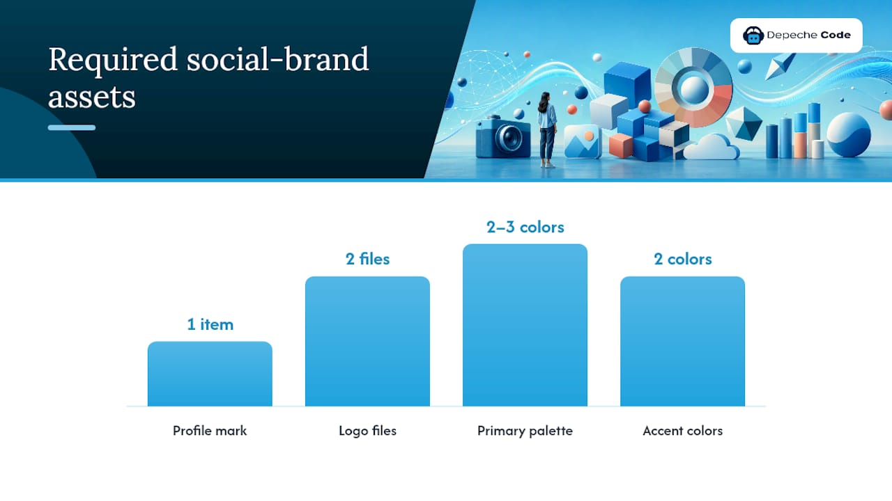
- Primary and secondary logo files, with minimum clear space and a list of banned treatments (no drop shadows, no stretching, no recoloring)
- A limited social palette: 2 to 3 primary HEX/RGB values plus 2 accent colors, no more
- Typography minimums: headline and body text must be large enough to remain legible on mobile devices
- Image composition rules: consistent crop ratios (1:1 for feed, 9:16 for Stories/Reels), a single approved filter or none at all
- Overlay and caption-card rules: font pairing, maximum line count, and required brand mark placement
Typography is where most guides get vague and most feeds get messy. Specify the actual font family, the fallback system font if the brand font isn’t supported natively (Instagram’s native text tools, for instance, don’t support custom fonts), and a hard minimum size for anything meant to be read on a phone screen held at arm’s length. If you’re rebuilding this system from scratch, reusable visual identity patterns for digital brands offer a useful starting framework before you adapt it specifically for social formats.
What Platform-Specific Rules Should You Include?
Platform rules are where most brand guides fall apart, because a rule that works on LinkedIn breaks on TikTok. Short-form video now dominates the format mix: HubSpot’s 2026 State of Marketing found that 60.1% of marketers use short-form video, and 48.6% say it delivers their best return on investment of any content type. That single data point should reshape how you allocate production time across your content calendar.
Build your platform section around these steps:
- Set the profile standard. Handle formation should follow one pattern (brand name, no underscores unless the clean handle is taken), bios should hit required elements within character limits, and cover images need a specified crop safe zone so text and faces don’t get cut off on mobile.
- Map content formats to platforms. Short-form vertical video belongs on TikTok, Reels, and Shorts. Carousels perform best on Instagram and LinkedIn for educational or listicle content. Long-form video and community posts still have a home on YouTube and Facebook Groups.
- Set cadence ranges, not fixed numbers. A realistic range for most B2B brands is 3 to 5 feed posts per week per platform, with daily Stories or short-form video where resources allow. Rigid daily quotas usually produce weaker content than a flexible range tied to what’s actually ready.
- Write the hashtag policy explicitly. Decide how many hashtags per platform (Instagram tolerates more than LinkedIn or Twitter/X), whether they go in the caption or first comment, and whether camel case (#SmallBizTips) is required for accessibility.
- Document channel-specific do’s and don’ts. LinkedIn: no meme formats, use data points. TikTok: no static image slideshows without captions. Facebook: prioritize native video over shared links for reach.
Scheduling tradeoffs deserve a line of their own. Posting five times a week with mediocre creative underperforms posting three times with content built around your actual pillars. If your team is still mapping out a realistic cadence, a content planning framework built for marketers and small teams can help you sequence formats against your calendar instead of guessing week to week.
What Templates and Asset Files Do You Actually Need?
The templates and files you build determine whether the guide gets used or ignored. A one-page quick reference paired with editable templates drives far more day-to-day adoption than a 40-page brand book nobody rereads after week one, according to structural research on social brand guide design.
Your essential template set should cover:
- Feed post templates (square and portrait) in your primary and secondary layout styles
- Story and Reel cover templates with locked logo placement
- Carousel templates for listicle and educational content, 5 to 7 slides
- A quote or testimonial card template with a fixed font pairing
- An event or announcement template with a clearly marked CTA zone
File organization prevents drift faster than any written rule. Build templates as editable masters, protect those masters with restricted permissions, and publish locked, production-ready export files for daily use, a structure recommended for preventing accidental brand changes. Name files consistently: platform, format, campaign, date. “IG_Story_Q1Sale_0315” beats “final final v2.”
The quick-reference card is the single highest-leverage asset in the whole system. Fit it on one page with essential usage guidelines, core color codes, and font details, and a three-line tone reminder. Anything that needs more explanation belongs in the full guide, not the card.
Campaign or seasonal variants should extend the base template, never replace it. Duplicate the master, swap the accent color and imagery, and keep the logo lockup and typography untouched.
Pro Tip: Store your quick-reference card as both a PDF and a phone-sized image file. Contributors are far more likely to check a rule mid-shoot if it opens instantly on a phone instead of requiring a laptop and a folder search.
What Accessibility Rules Belong in a Social Brand Guide?
Alt text, caption files, and contrast checks are not optional extras. They belong in the core guide alongside your color codes, not in a footnote. Most brands still neglect accessibility entirely, which means the ones that mandate it stand out for the right reasons and reach viewers competitors quietly exclude.
Your accessibility checklist should require:
- Alt text on every image post, written to describe the content and purpose, not just the file name
- Closed captions or on-screen text burned into every video, since most viewers watch social video with sound off
- Minimum contrast ratio between text and background (aim for at least 4.5:1 for standard text)
- Minimum readable font sizes on any text overlaid on an image or video frame
- Camel-case hashtags (#SmallBusinessSaturday, not #smallbusinesssaturday) so screen readers parse each word correctly
Roughly one in four American adults lives with a disability that could affect how they experience social content, according to figures cited in accessibility guidance from institutions like the University of Maryland. Treating alt text as a checkbox rather than a real description throws away a meaningful share of your potential audience before the post even gets a chance.
Accessible content also tends to perform better in the algorithm. Captions increase watch time on muted autoplay video, and clean contrast improves scroll-stopping power even for viewers with no visual impairment. Building accessibility into your guide isn’t a compliance chore. It’s a reach strategy that happens to also do the right thing.
Quick validation tools worth adding to your workflow: built-in platform caption generators, a free contrast checker before graphics go to export, and a five-second alt-text review as a standing step in your approval workflow.
Who Approves Social Posts, and What Happens in a Crisis?
Governance is the part most guides skip, and it’s the part that prevents the worst outcomes. Every social brand guide needs a named owner, a review cadence, and a documented approval path before the first post ever goes out under the brand name.
Structure your governance section around these five components:
- Name the owner. One person (usually a marketing manager or social lead) owns the guide itself, approves major updates, and is the final call on ambiguous brand judgment questions.
- Set version control. Date-stamp every guide revision, keep a change log, and archive old versions rather than overwriting them, so teams can see exactly what changed and when.
- Build the approval workflow with real SLAs. Standard posts might need one approver with a 24-hour turnaround; paid campaigns or executive-voice content might need two approvers and 48 hours. Write the SLA down so contributors know what to expect.
- Draft the crisis playbook before you need it. Include a pause protocol (who can halt scheduled posts immediately), a holding statement template, and an escalation chain naming exactly who gets looped in for legal, PR, or executive review, and at what severity threshold.
- Define the permissions model. Specify who can post live without review (usually only the owner or a senior team member), who needs pre-approval (junior staff, agency contributors, interns), and whether external partners get their own restricted access tier.
Legal and compliance notes belong here too. Style guide research on governance structures points to including customer care escalation rules, employee advocacy boundaries, and industry-specific disclosure requirements (financial, healthcare, and legal brands especially need to spell out required disclaimers) directly in the guide rather than in a separate compliance memo nobody reads.
How Do You Measure and Audit Brand Consistency?
Brand consistency needs numbers behind it, not just a feeling that “things look right.” Track a short list of KPIs that actually reflect brand health: percentage of posts following the approved template, alt-text completion rate, average time from draft to approval, and engagement rate broken out by content pillar.
Run a quarterly audit using a defined sampling method rather than eyeballing the feed. A recommended approach reviews 10 to 15% of posts per channel each quarter, scoring each sampled post on a short checklist covering logo usage, voice adherence, accessibility compliance, and CTA alignment. The audit produces a score, and the score produces prioritized remediation tickets, not just a vague “let’s tighten this up” note in a meeting.
Your quarterly audit checklist should include:
- Logo and color usage across the sampled posts (pass/fail against locked specs)
- Voice and tone adherence against the pillar language
- Alt text and caption presence on every sampled asset
- CTA placement and link consistency
- A brief note on any off-template creative and why it happened
Certain events should automatically trigger a guide update outside the normal quarterly cycle: a logo refresh, a new platform launch, a rebrand, or a recurring audit failure on the same rule three quarters running. If the same violation shows up repeatedly, the rule itself is probably unclear or unrealistic, not the team executing it.
Reporting should go to whoever owns remediation, not just sit in a dashboard. A short monthly summary, quarterly audit score, and a named task owner for each flagged issue keeps consistency from becoming an abstract goal. Research on brand consistency’s business impact backs up why this matters commercially, not just aesthetically: consistent brand presentation across channels correlates directly with audience trust and recall.
How Do You Get Your Team to Actually Follow the Guide?
Adoption is a design problem before it’s a discipline problem. Research on brand guide usability points to a short quick-reference card, locked templates, a named owner, and real onboarding as the factors that predict whether a guide gets used, far more than document length does.
Build a short onboarding runbook for every new contributor, whether they’re a full-time hire, a freelancer, or an agency partner:
- A 30-minute walkthrough of the quick-reference card and template library before their first post
- A mandatory checklist signed off before publishing access is granted (read the tone guide, confirm access to templates, understand the approval SLA)
- A first-month buddy system where a senior team member reviews their early posts against the checklist
- Monthly spot-checks on a small sample of their published work, feeding straight into the quarterly audit
Integrate templates directly into the tools your team already uses. Locked Canva templates, shared Figma component libraries, and pre-built content blocks in your scheduling tool remove the friction that causes people to freelance their own version of a graphic instead of pulling the approved one.
Incentivize adoption instead of only policing it. Highlight strong on-brand posts in team meetings, track improvement in audit scores over time, and treat a rising consistency score as a real team win, not just a compliance metric.
Pro Tip: Give new contributors the one-page quick-reference card before the full guide, not after. Most people never make it past page three of a long document, but almost everyone reads one page.
A Starter Social Brand Kit Worth Copying
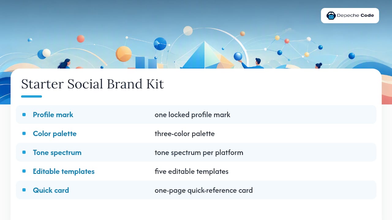
Most teams don’t need a 60-page brand book. They need a working starter kit: one locked profile mark, a three-color palette, a tone spectrum for each active platform, five editable templates, and a one-page quick-reference card. That’s the minimum viable version, and it’s usually enough to stop the drift that makes a feed look like five different companies posting.
Where an engagement with Depechecode typically adds value is in building that starter kit fast and correctly the first time. A typical scope includes a working session to define messaging pillars, a locked template library built in the tools your team already uses, an accessibility pass on existing content, and a quick-reference card designed to actually get opened. Deliverables usually land within a few weeks rather than months, because the framework above is repeatable, not something built from a blank page each time.
The DIY-versus-agency decision usually comes down to bandwidth, not capability. A marketing team with one dedicated social hire can absolutely build this system using the checklist in this guide. A team splitting social duties across five other responsibilities usually gets there faster with outside help building the first version, then maintains it internally afterward. Either path works if the guide ends up short, specific, and actually used.
Employee Advocacy: Extending the Brand Beyond the Official Accounts
Employee posts about your company carry more organic trust than branded posts, but only if there’s a clear line on what’s encouraged versus what’s off limits. Your guide needs a short, standalone section on employee usage, separate from the main brand rules, because employees are operating from personal accounts with personal audiences.
Cover three things explicitly. First, what employees can freely share: job openings, public company milestones, event recaps, and general industry commentary that doesn’t touch confidential information. Second, what requires a check first: anything quoting internal metrics, customer names, or unreleased product details. Third, what’s off limits entirely: confidential financials, unannounced partnerships, and anything that could be read as an official company statement without being cleared as one.
Give advocates real tools instead of just rules. A shared folder of approved graphics sized for personal profiles, a short list of suggested captions they can adapt in their own voice, and a simple way to flag a post for a quick brand check before it goes out. Governance frameworks that address advocacy directly treat this as part of the core social guide rather than a separate HR document, and that integration matters. Employees who feel like they’re breaking a rule they never saw usually stop posting altogether, which defeats the entire point of advocacy.
Set expectations, not quotas. Nobody should be required to post about the company on a personal profile. The goal is making it easy and safe for the people who want to, not mandating participation.
Making Sure Social Fits Your Bigger Brand Picture
A social media brand guide that contradicts your print materials, your website, or your in-store signage creates the exact inconsistency it was supposed to prevent. The fixed elements you locked for social (the profile mark, the primary palette, the tone spectrum) should trace directly back to your master brand guidelines, not exist as a parallel system invented separately by whoever manages the social calendar.
Cross-check three things whenever you update either guide: color values (a social palette drifting from your print CMYK equivalents is a common and avoidable error), voice consistency (a formal print tone paired with a casual social voice needs to be an intentional choice, not an accident of two teams never talking), and campaign timing (offline promotions and social content should launch in the same window, not weeks apart because nobody synced calendars).
Offline events are a natural bridge point. A trade show booth, a print ad campaign, or a local sponsorship all generate content opportunities that should flow straight into your social calendar using the same templates and hashtags you’ve already locked in the guide. Treating social as an afterthought to offline marketing, rather than an extension of it, is one of the most common gaps between a brand’s intended identity and what customers actually see day to day.
What Most Brand Guides Get Backward
Most social media style guides start with the wrong question. They ask “what does our brand look like?” when the real starting question should be “what will our team actually use?” A gorgeous 50-page PDF that sits unopened in a shared drive protects nothing. A one-page card taped next to someone’s monitor gets followed.
The conventional advice treats brand consistency as a design problem solved once and filed away. It isn’t. Consistency is an operations problem that needs a named owner, a review cadence, and quarterly proof that the rules are still being followed, the same way you’d audit any other recurring business process. Authenticity and human-led short video remain genuine priorities heading into 2026 even as AI tools spread through content production, which means your guide also needs explicit rules for where AI assistance is appropriate and where it isn’t, rather than staying silent on the question.
If you take one thing from this guide, take this: build the quick-reference card first, not last. Everything else, the full color palette, the platform matrix, the governance workflow, can be built out over the following weeks. But a team without that one page will keep guessing, and guessing is what created the inconsistent feed you’re trying to fix in the first place.
— Donovan Wells – Founder and CEO
How a digital agency can help you build and run this system
Depechecode is the practical shortcut for marketing teams who know what a good social brand guide looks like but don’t have the hours to build one from scratch. Rather than handing you another template to fill out alone, Depechecode’s social media management services build the template library, tone rules, and accessibility pass directly into a system your team can run day to day.
A typical engagement starts with a working session to lock your messaging pillars and platform rules, moves into building your editable template set and quick-reference card, and finishes with an accessibility audit on your existing content so nothing published under your name falls short of contrast or caption standards. If you’re also rethinking your broader content calendar alongside the brand rules, Depechecode’s social media management team can fold both into a single engagement instead of two separate projects.
Ready to see what a starter kit built for your brand looks like? Reach out to a digital agency specializing in social media to scope a project around your specific platforms, team size, and timeline, and get a working guide your team will actually open.
Sources
For a deeper look at how institutions handle profile consistency across departmental accounts, Cambridge’s brand resources for social media is worth bookmarking as a policy reference. For accessibility specifics, including contrast ratios and alt text standards, University of Maryland’s accessibility guidance for social graphics offers concrete, checkable rules rather than general advice.
For structural checklists on what sections a brand guide needs, Agorapulse’s guide breakdown and platform-format planning data from HubSpot’s 2026 State of Marketing both offer downloadable frameworks and current platform benchmarks worth cross-checking against your own guide as you build it out.
- Social media branding — University of Cambridge brand resources
- Social media branding guidelines: What you need to know — Agorapulse
- Social media strategy for your business — HubSpot (2026)
- Creating accessible social graphics — University of Maryland accessibility
FAQ
What Is the 5-5-5 Rule for Social Media?
The 5-5-5 rule suggests spending 5 minutes engaging with other accounts, posting to 5 platforms strategically, and reviewing analytics for 5 minutes daily; treat it as a loose habit framework rather than a rigid brand rule, since cadence should follow your content calendar, not a fixed daily formula.
What Is the 3-7-27 Rule of Branding?
Definitions of the 3-7-27 rule vary across marketing sources, and it isn’t a standardized branding principle covered by the research behind this guide, so treat any numeric claim about it with caution rather than as an established industry standard.
What Are the 5 C’s of Branding?
Common versions of the 5 C’s include company, customer, competitors, collaborators, and climate (market conditions), used as a strategic audit framework before building visual and voice rules; the exact list varies by source, so confirm which version your team is referencing before applying it.
What Is the 5-3-1 Rule for Social Media?
The 5-3-1 rule is a content-mix guideline suggesting 5 pieces of curated content, 3 original posts, and 1 promotional post within a given posting cycle, helping teams avoid feeds that feel purely sales-driven.
How Often Should We Update Our Social Brand Guide?
Review the full guide at least quarterly alongside your consistency audit, and trigger an off-cycle update immediately after a logo refresh, a new platform launch, or a repeated audit failure on the same rule.
Does Depechecode Build Custom Social Brand Guides?
Yes. Depechecode’s social media services include building the template library, tone rules, and accessibility pass that turn a written guide into a system your team can actually run day to day.