TL;DR:
- Creating website wireframes involves defining goals, mapping user flows, and using low-fidelity sketches to focus on structure. AI tools now enable fast generation of starter layouts, speeding up early design phases. Collaboration and early feedback ensure the wireframe effectively guides development and improves user experience.
A website wireframe is a low-fidelity structural blueprint that maps layout, content placement, and user flow before any visual design begins. Knowing how to create website wireframes correctly separates projects that ship on time from those that spiral into costly revisions. Tools like Figma, Miro, and Penpot have made the process faster and more collaborative than ever, and AI-assisted options now generate starter layouts in minutes. This guide walks you through every phase, from goal setting to feedback loops, so you can wireframe a website with confidence in 2026.
How to create website wireframes: what you need before you start
Effective wireframing starts with clarity on two things: what the site must do and who will use it. Skip this step and you will spend hours rearranging boxes that represent the wrong content entirely.
Define your project goals first. Write down the primary action you want visitors to take, whether that is filling out a contact form, making a purchase, or booking a call. Every layout decision flows from that single goal. Mapping user flows in plain text before touching any tool prevents wasted time rearranging visual elements later, since user flow lists allow faster iteration than moving elements in layouts during early design phases.
Choosing the right website wireframing tools
The tool you pick shapes how fast you can iterate. Here is a breakdown of the most widely used options in 2026:
| Tool | Free Tier | Best For |
|---|---|---|
| Figma | Yes | UX/UI designers, team collaboration |
| Miro | Yes | Visual thinkers, remote teams |
| Penpot | Yes (open source) | Developers who want design control |
| Creately | Yes | Project managers, flowcharts |
Tools like Miro, Penpot, and Creately provide features suitable for individuals and small teams without any financial investment. That removes the cost barrier for learners and freelancers starting out.
AI-assisted wireframing tools have changed the speed of early planning. AI tools like Elementor’s AI Site Planner and Miro’s Sidekicks generate starter wireframe layouts from a short text prompt. That means you can go from a blank screen to a rough structural draft in under five minutes.
Pro Tip: Before opening any tool, write your user flow as a numbered list in a plain text document. List every step a visitor takes from landing page to conversion. This list becomes your wireframe’s skeleton.
Some teams also need their wireframing tool to connect with project management software. Tools that integrate with Jira improve handoff between designers and developers and reduce back-and-forth during production.
How do you plan and draft website wireframes step by step?
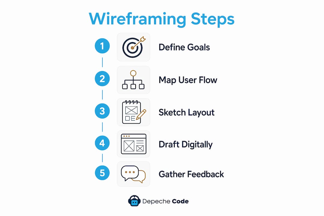
The wireframing process covers 4–5 phases: goal definition, user flow mapping, sketching, digital drafting, and feedback. Each phase builds on the last, so rushing ahead skips critical logic checks.
Step 1: Sketch before you open a tool
Hand-drawn sketches remain a favored first step even when digital tools are available, because they speed up brainstorming and remove the intimidation of a complex interface. Grab paper and draw rough boxes for the header, navigation, hero section, and footer. Do not worry about proportions. The goal is to get ideas out of your head and onto a surface where you can evaluate them.

Pro Tip: If a blank page freezes you, start by sketching only the navigation bar and the hero section. Those two elements force you to answer the most important layout questions first.
Step 2: Build the content hierarchy
Once you have a rough sketch, translate it into a digital wireframe using your chosen tool. Place elements in this order:
- Header and primary navigation
- Hero section with the main headline and primary call to action
- Supporting content blocks (features, benefits, testimonials)
- Secondary calls to action and forms
- Footer with links and contact details
A good wireframe presents clear content hierarchy with conversion points visible early to support intuitive navigation. Visitors should never have to hunt for the action you want them to take.
Step 3: Use placeholders, not real content
Replace images with labeled boxes marked “Hero Image” or “Team Photo.” Replace body copy with gray bars or the label “Body Text.” This keeps the wireframe low-fidelity and forces reviewers to focus on structure rather than word choice or photography. Wireframes should remain low-fidelity during early phases to allow faster iteration without emotional attachment to visual details.
Step 4: Add interactive elements
Mark every button, link, and form field clearly. Label buttons with their intended action, such as “Submit Form” or “View Pricing.” If you are creating wireframes online in Figma or Miro, add simple click-through connections between screens so stakeholders can follow the user flow without explanation. This step reveals navigation gaps before a single line of code is written.
What are best practices and common mistakes in wireframe design?
Wireframe design best practices center on one rule: keep it simple until the structure is proven. Designers who rush to high-fidelity mockups before the layout is validated waste time on visuals that will change anyway.
Keep wireframes grayscale. Color triggers emotional reactions and pulls attention away from layout decisions. A wireframe reviewed in black, white, and gray gets feedback on structure. A wireframe with brand colors gets feedback on whether the blue is the right shade.
“Wireframes are essential blueprints that align teams on requirements and focus UX conversations.” — Figma Resource Library
Avoid these common mistakes:
- Adding real photography or final copy before the layout is approved
- Skipping mobile layouts and designing only for desktop
- Creating a single wireframe version instead of two or three layout options
- Presenting wireframes to stakeholders without explaining what they are looking at
- Ignoring user flow issues because the boxes “look balanced”
Pro Tip: Show stakeholders a completed user journey, not just a single page. Walk them through the flow from the landing page to the thank-you screen. This prevents approvals that fall apart when the full path is reviewed later.
Experienced designers begin wireframing only after mapping user flows in bullet or list form to avoid logic flaws. That pre-work catches problems that no amount of visual polish can fix. Reviewing your website redesign dos and don’ts before finalizing a wireframe structure also surfaces UX pitfalls that repeat across projects.
How can you use feedback and collaboration to improve wireframes?
Wireframes act as a single source of truth in cross-functional teams, preventing miscommunication during development. That value only materializes if you share wireframes early and gather structured input.
Setting up a feedback loop
Share your wireframes with stakeholders before you feel they are ready. Early feedback on a rough draft costs nothing to act on. Feedback on a polished mockup is expensive to implement. Use this process:
- Share the wireframe with a short written summary of the user flow it represents.
- Ask reviewers to comment on structure and navigation, not visual style.
- Collect all comments in one place before making any changes.
- Prioritize changes that affect user flow over changes that affect appearance.
- Share the revised wireframe and confirm alignment before moving to high-fidelity design.
Collaborative digital whiteboards like Conceptboard create smooth feedback loops and version control for wireframing processes. Miro offers similar functionality with commenting, voting, and version history built in.
Cross-functional involvement matters. Developers catch technical constraints early when they review wireframes. Project managers spot scope creep before it becomes a budget problem. Designers identify UX gaps that clients cannot articulate. Bring all three groups into at least one review session.
Limit visual distractions during review sessions. If your wireframe tool allows it, present in a simplified view that hides layer panels and tool menus. Reviewers focus better when the screen shows only the wireframe.
Pro Tip: After each feedback round, map every comment back to a specific step in your user flow list. If a comment does not connect to a user action, it is probably a visual preference, not a structural fix.
Key takeaways
Effective website wireframes require a structured process: define goals, map user flows, sketch layouts, and iterate based on feedback before moving to visual design.
| Point | Details |
|---|---|
| Start with user flow mapping | Write user flows as a plain text list before opening any design tool. |
| Choose tools that fit your team | Figma, Miro, Penpot, and Creately all offer free tiers for individuals and small teams. |
| Keep wireframes low-fidelity | Use placeholders and grayscale to focus reviews on structure, not aesthetics. |
| Share wireframes early | Early feedback on rough drafts costs nothing; late feedback on polished mockups costs everything. |
| Use AI to speed up drafts | Tools like Elementor’s AI Site Planner generate starter layouts from a text prompt in minutes. |
Wireframing is a communication skill, not just a design skill
I have reviewed hundreds of web projects over the years, and the ones that went sideways almost always had the same root cause: the team skipped the wireframe phase or treated it as a formality. They jumped straight to visual design, the client reacted to colors and fonts, and the actual navigation logic never got a proper review. By the time development started, the user flow had three dead ends nobody had noticed.
The shift that changed everything for me was treating wireframes as conversation starters rather than deliverables. A rough sketch on paper shown to a client in the first week is worth more than a polished Figma file shared in week four. The rough version invites honest input. The polished version invites silence because nobody wants to say the expensive-looking thing is wrong.
AI tools have genuinely improved the early stages. Generating a starter layout from a text prompt removes the blank-canvas problem and gives the team something concrete to react to immediately. That said, I still sketch by hand first. The act of drawing forces you to make layout decisions consciously rather than accepting whatever the AI defaults to.
The best wireframing practice I know is also the simplest: never show a single page in isolation. Always walk stakeholders through the full user journey. A homepage that looks perfect in isolation can still send users to a dead end on page three. The journey is the product.
— Donovan
Ready to take your website from wireframe to live?
Planning a website is one thing. Building it to perform is another. Depechecode is a full-service digital agency based in Orlando that takes projects from the wireframing and planning phase all the way through development, launch, and ongoing SEO. Whether you are starting from scratch or redesigning an existing site, the team at Depechecode brings structure, speed, and technical depth to every project.

Explore Depechecode’s website design and development services to see how a structured, professional process turns your wireframes into a site that converts. If you are working with a tighter budget, the free website development option is a practical starting point worth reviewing.
FAQ
What is a website wireframe?
A website wireframe is a low-fidelity structural blueprint that shows the layout, content placement, and navigation of a web page without visual design elements like color or typography.
What are the best free website wireframing tools in 2026?
Figma, Miro, Penpot, and Creately all offer free tiers with templates and collaboration features suitable for individuals and small teams.
How do you wireframe a website for the first time?
Start by writing your user flow as a numbered list, then sketch rough page layouts by hand before moving to a digital tool like Figma or Miro to build a low-fidelity draft.
Should wireframes include real content or placeholder text?
Wireframes should use placeholder text and labeled image boxes during early phases. Real content pulls reviewer attention away from layout and navigation decisions.
How does AI help with wireframing?
AI-assisted tools like Elementor’s AI Site Planner and Miro’s Sidekicks generate starter wireframe layouts from a short text description, reducing initial planning time significantly.