

TL;DR:
- Effective homepage design starts with a clear headline, strong navigation, and authentic visuals to guide visitors. Social proof placed near CTAs builds trust, and mobile-first layouts ensure responsiveness across devices. Limiting each section to one primary CTA enhances user focus and conversion rates.
Your homepage is your most important web page. Effective homepage design elements are the essential building blocks that make a website clear, engaging, and conversion-focused from the first glance. High-performing business websites typically include between 5 and 8 distinct sections, starting with a hero block and ending with a footer. Each section serves a specific purpose: communicate value, build trust, and guide visitors toward action. The businesses that get this right see measurable gains in engagement and revenue.

1. What are the must-have homepage design elements?
The hero section is the first thing visitors see, and it sets the tone for everything that follows. A strong hero consists of a clear headline, subheading, and CTA paired with a relevant visual that supports your value proposition. Visitors decide within seconds whether to stay or leave based on hero clarity alone. Get this section wrong, and no other element on the page will save you.
The headline carries the heaviest load of any copy on your homepage. Specific, audience-targeted value propositions outperform vague statements by a wide margin. “We help Orlando restaurants fill tables on slow nights” beats “We grow your business” every time. Precision builds immediate credibility.
Here are the core elements every high-performing homepage needs:
- Hero section: Headline, subheading, primary CTA, and supporting visual
- Navigation menu: Clear, descriptive labels with no more than 5–7 items
- Value proposition: A direct statement of what you do and who you serve
- Social proof: Testimonials, client logos, or press mentions placed near CTAs
- Contact information: Phone number, email, or live chat visible without scrolling
- Supporting media: Authentic images or a short video that reinforces your message
- Footer: Key links, legal pages, and contact details organized for easy scanning
Pro Tip: Place your phone number or contact link in the top-right corner of your header. Visitors who are ready to buy look there first.
2. How does intuitive navigation contribute to an effective homepage layout?
Navigation is the skeleton of your homepage user experience. When visitors cannot find what they need within seconds, they leave. The fix is not creative menu labels. It is clarity.
“Effective navigation should be straightforward and guide users with familiar labels rather than creative expression. Descriptive labels like ‘Services,’ ‘About,’ and ‘Contact’ reduce cognitive load and improve information scanning efficiency.”
Descriptive navigation labels reduce cognitive load and help visitors scan your site faster. “What We Do” works. “Our Magic” does not. Familiar words tell visitors exactly where they are going before they click.
Limit your main menu to 5–7 items. Every item you add past that threshold competes for attention and dilutes the importance of your primary pages. A cluttered menu signals a cluttered business.
Key navigation practices that improve homepage performance:
- Use sticky headers so the menu stays visible as visitors scroll
- Label menu items with nouns, not phrases or slogans
- Make the primary CTA button visually distinct from navigation links
- Test mobile navigation with a hamburger menu that opens cleanly
- Avoid dropdown menus with more than two levels
A sticky header keeps your CTA and contact options accessible at every scroll depth. That single change reduces the friction between interest and action.
3. What visual design techniques elevate homepage effectiveness?
Visual hierarchy is the practice of arranging elements so visitors naturally read the most important content first. Bold visual hierarchy and consistent branding color palettes improve scanability and brand recognition across your entire homepage. The contrast between a large headline and smaller body text guides the eye without any instruction.
Consistent use of brand colors, typography, and imagery builds recognition across every page. Visitors who see the same palette on your homepage and your service pages feel they are in a familiar, trustworthy environment. Inconsistency creates doubt.
Authentic images outperform generic stock photos on every metric that matters. A photo of your actual team, your real product, or your physical location tells a story that a smiling stock model never can. Visitors connect with real people and real places.
Whitespace is not empty space. It is a design tool that draws attention to what matters. Surrounding your primary CTA with whitespace makes it the natural focal point of the section. Crowding it with text and icons buries it.
- Use a maximum of two or three brand colors across the homepage
- Set headline font size at least 2x larger than body text
- Choose images that reflect your actual customers or team
- Leave breathing room around every CTA button
- Use animation sparingly and only when it adds meaning, not decoration
Pro Tip: Add descriptive alt text to every homepage image. It improves accessibility for screen reader users and gives search engines additional context about your page content.
4. What role does social proof and trust signals play on a homepage?
Social proof answers the question every visitor is silently asking: “Can I trust these people?” The answer has to come from someone other than you. Placing testimonials or logos adjacent to CTAs builds trust at the exact moment visitors are deciding whether to act.
The most effective types of social proof for a business homepage include:
- Customer testimonials: Short, specific quotes with a name and photo carry more weight than anonymous praise
- Client logos: Recognizable brand logos signal that credible organizations trust you
- Press mentions: A “As seen in” bar with media outlet logos builds authority fast
- Star ratings: Aggregate review scores from Google or industry platforms add third-party validation
- Case study links: A single sentence result (“We helped a local retailer increase web leads by rebuilding their homepage”) with a link to the full story
Trust signals operate differently from testimonials. Security badges, money-back guarantees, and industry certifications address risk rather than quality. Place them near your pricing section or contact form, where purchase anxiety peaks.
The placement rule is simple: put social proof where hesitation lives. That means directly below your hero CTA, next to your pricing, and above your contact form. Social proof placed in the footer is largely ignored.
5. How can homepage layouts be optimized for mobile and scanning behaviors?
Mobile users represent roughly 62% of visitors to most business websites. That number means your homepage must perform on a 375-pixel screen before you worry about how it looks on a desktop monitor.
Mobile-first design starts with content prioritization. Every element you place above the fold on mobile must earn its position. The headline, subheading, and primary CTA should all be visible without scrolling on a standard smartphone screen.
Mobile layout priorities
| Element | Desktop approach | Mobile approach |
|---|---|---|
| Navigation | Full horizontal menu | Hamburger menu with sticky header |
| Hero CTA | Large button, centered | Full-width button, thumb-zone placement |
| Images | Side-by-side layouts | Single-column stacked images |
| Text blocks | Two or three columns | Single column, larger font size |
| Contact info | Header top-right | Sticky footer bar or tap-to-call button |
Thumb-zone optimization means placing your most important tap targets in the lower-center area of the screen. That is where thumbs naturally rest on a phone held in one hand. A CTA button buried at the top of a mobile screen requires an awkward stretch to tap.
Page loading speed directly affects mobile bounce rates. Heavy images, unoptimized video, and excessive scripts slow load times and cost you visitors before they ever see your homepage content. Compress images, defer non-critical scripts, and test load speed regularly using tools like Google PageSpeed Insights.
For scanning behavior on any device, use short paragraphs, bold subheadings, and bullet points to break up content. Visitors scan before they read. Give them clear visual anchors so they can find what they need without reading every word.
Explore homepage design ideas for 2026 to see how leading businesses are adapting their layouts for mobile-first audiences.
6. How to use CTAs that actually convert
Limiting CTA options to one primary button per section reduces visitor overwhelm and increases click-through rate. Every additional CTA you add splits attention and dilutes the impact of your primary action. One section, one goal.
CTA button design follows three rules. First, use a color that contrasts with your background so the button is impossible to miss. Second, write button text that describes the outcome, not the action. “Get My Free Quote” outperforms “Submit” because it tells visitors what they receive. Third, surround the button with whitespace so it stands alone visually.
The language of your CTA matters as much as its placement. First-person phrasing consistently outperforms second-person. “Start My Free Trial” converts better than “Start Your Free Trial” because it creates a sense of ownership before the click happens.
Secondary CTAs belong below the fold. Use them to capture visitors who need more information before committing. A “Learn More” link after a service description or a “See Our Work” button after a portfolio preview gives hesitant visitors a lower-stakes next step.
Pro Tip: Test your CTA button color against your background using a contrast checker. WCAG 2.1 accessibility standards require a minimum contrast ratio of 4.5:1 for normal text and interactive elements.
7. Why footer design is a key homepage element
The footer is the last thing visitors see, and it does more work than most businesses realize. A well-designed footer functions as a secondary navigation system for visitors who scroll past all your content without finding what they need. Footer layout and UX directly affects how long visitors stay and whether they convert.
A high-performing footer includes your logo, a short tagline, key service links, contact information, social media icons, and legal pages. Organize these into two or three columns so the content is scannable rather than a wall of links.
Contact information in the footer serves a specific audience: visitors who have already decided they want to reach you but cannot find your contact page. Make your phone number, email address, and physical location (if relevant) easy to find without any clicking.
Key takeaways
A homepage that converts combines a clear headline, intuitive navigation, authentic visuals, and social proof placed exactly where visitors hesitate most.
| Point | Details |
|---|---|
| Hero section clarity | Your headline and CTA must communicate value within the first few seconds of a visit. |
| Navigation simplicity | Limit menu items to 5–7 with descriptive labels to reduce cognitive load. |
| Social proof placement | Position testimonials and trust signals directly adjacent to CTAs for maximum impact. |
| Mobile-first layout | Design for 375-pixel screens first; 62% of visitors arrive on mobile devices. |
| One CTA per section | A single primary button per section reduces confusion and increases click-through rate. |
What I have learned from watching homepages succeed and fail
I have reviewed hundreds of business homepages across industries, and the pattern is always the same. The ones that convert are not the prettiest. They are the clearest.
The biggest mistake I see is businesses treating their homepage like a brochure. They list every service, feature every team member, and include three different CTAs in the hero section. The result is a page that says everything and communicates nothing.
The second most common mistake is burying the value proposition. Visitors should not have to scroll to understand what you do. If your headline requires explanation, rewrite it. If your subheading is doing the work your headline should be doing, swap them.
Social proof is the element most businesses get wrong in a different way. They place it at the bottom of the page, in a section nobody reaches. The businesses that convert put their best testimonial directly below the hero CTA, where doubt is highest.
My honest recommendation: start with your headline and your primary CTA. Get those two elements right before you touch anything else. Analytics will tell you what to adjust next. A homepage is never finished. It is always being tested.
— Donovan
How Depechecode builds homepages that perform
Depechecode is a full-service digital agency based in Orlando that builds business websites designed to convert visitors into customers.
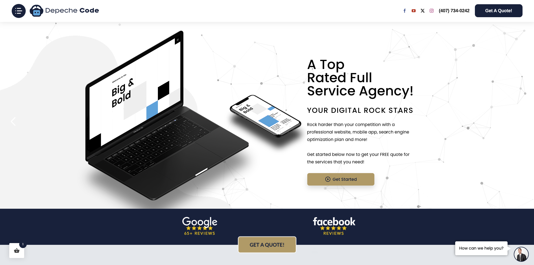
Every homepage Depechecode builds starts with your value proposition and works outward from there. The team applies the layout principles, navigation standards, and mobile-first practices covered in this article to every project. Whether you need a full website design and development engagement or a targeted homepage redesign, Depechecode delivers work that is on time, on budget, and built to perform. Contact the team today to discuss what your homepage needs to reach its potential.
FAQ
What are the most important homepage elements?
The most important homepage elements are the hero section, navigation menu, value proposition headline, primary CTA, and social proof. These five components determine whether a visitor stays or leaves within the first few seconds.
How many sections should a homepage have?
High-performing business websites typically include between 5 and 8 distinct sections. Starting with a hero block and ending with a footer gives visitors a complete picture without overwhelming them.
Where should I place testimonials on my homepage?
Place testimonials directly adjacent to your primary CTA. Social proof positioned at the moment of decision addresses visitor skepticism and increases the likelihood of a click.
How do I make my homepage mobile-friendly?
Design for a 375-pixel screen first, place your CTA in the thumb zone, use a sticky header with a hamburger menu, and compress all images to reduce load time. Mobile users represent roughly 62% of website visitors, so mobile performance is not optional.
How many CTA buttons should a homepage have?
Use one primary CTA button per section. Multiple CTAs in the same section split visitor attention and reduce overall click-through rate. Secondary CTAs belong lower on the page for visitors who need more information before committing.