

Responsive web design is the right call for SEO, full stop. Google strongly recommends it as the easiest configuration to maintain under mobile-first indexing, and the reason is structural: one URL, the same HTML, and CSS handling all the layout shifts. That means every backlink, every internal link, and every crawl signal points to a single canonical source instead of being split across an m-dot subdomain or a parallel URL set.
Your immediate next step: open Google Search Console, pull the Mobile Usability report, and fix any critical errors before you touch anything else. Then check your Core Web Vitals (LCP, CLS, INP) in the PageSpeed Insights field data tab. Those two checks alone will surface the issues that cost you the most ranking ground right now.
Here is what this guide covers, in order of impact:
- Single-URL architecture consolidates ranking signals and eliminates duplicate-content risk
- Core Web Vitals (LCP, CLS, INP) are directly tied to responsive implementation choices
- Content parity between mobile and desktop is required, not optional, under mobile-first indexing
- Depechecode’s pre-launch → launch → 30-day checklist gives you a vetted process to follow during any responsive redesign
Table of Contents
- What responsive web design actually means for SEO
- How responsive design affects your rankings and discoverability
- Key technical SEO elements to implement on responsive sites
- Performance and Core Web Vitals: what to measure and how responsive choices affect them
- UX, readability, and accessibility considerations that improve mobile SEO
- Common responsive implementation mistakes and how to fix them
- How to test and monitor responsive SEO
- Practical responsive redesign SEO checklist (pre-launch → launch → post-launch)
- Key Takeaways
- The part of responsive SEO most agencies get wrong
- Depechecode’s responsive design and SEO services
- Authoritative resources and tools to run tests and learn more
- FAQ
What responsive web design actually means for SEO
Responsive web design (RWD) is a single-URL, single-HTML approach where CSS controls how the layout adapts across screen sizes. The server sends the same document to every device; the browser handles the rest using fluid grids, media queries, and, in modern implementations, container queries.
That single-URL delivery is the core SEO advantage. Backlinks and internal link equity consolidate on one address instead of splitting between a desktop URL and a mobile equivalent. Canonical management becomes trivial. Structured data lives in one place. And Google’s crawler only needs to visit one URL to understand the full page, which simplifies indexation and reduces crawl overhead.
Modern responsive implementations go beyond breakpoints. Fluid typography with clamp() lets font sizes scale continuously between a minimum and maximum without hard jumps. Container queries let components respond to their own container width rather than the viewport, which keeps CSS leaner and reduces the runtime layout recalculations that hurt performance. These are not optional refinements; they are the current responsive standard for sites that need both good UX and strong technical SEO.
How responsive design affects your rankings and discoverability
Google’s mobile-first indexing means the mobile version of your page is what gets evaluated for ranking. Not the desktop version. The mobile version. If your mobile content is thinner, slower, or structurally different from desktop, you are being ranked on the weaker version of your own site.
Responsive design solves this by making the mobile view the canonical crawl source by default. There is no separate mobile site to maintain, no redirect chain to debug, and no risk that the Googlebot smartphone crawler sees different content than the desktop crawler.
A few specific mechanisms worth understanding:
- Link equity consolidation. Responsive design keeps all backlink value on one URL, whereas m-dot setups often split authority between
example.comandm.example.com, even with proper canonicals. - Crawl budget efficiency. Responsive design reduces redirect chains and simplifies crawls, which matters for large sites where Googlebot has a finite crawl budget per domain.
- Structured data consistency. Schema markup lives in one HTML document, so you never risk serving rich-result eligibility on desktop but not mobile.
- Duplicate content elimination. No parallel URL sets means no risk of self-competition or diluted signals from near-identical pages at different addresses.
Performance is the other half of the ranking equation. Core Web Vitals are directly affected by responsive design choices such as image sizing, font loading, and layout techniques. A responsive site with poor performance can still rank below a slower desktop-only site if the CWV scores are bad enough. Architecture and performance have to work together.
Key technical SEO elements to implement on responsive sites
Getting the architecture right is table stakes. These are the technical items that dev and SEO teams need to verify on every responsive project.
Viewport meta tag. Every page needs this in the <head>:
<meta name="viewport" content="width=device-width, initial-scale=1">
Without it, mobile browsers render the page at desktop width and scale it down, which breaks layout and tanks usability scores.
Mobile-first CSS. Write base styles for the smallest screen first, then use min-width media queries to add complexity as the viewport grows. This keeps the default stylesheet lean and avoids shipping desktop-only CSS to mobile users.
Responsive images. Use srcset and sizes so browsers download the appropriately sized image for their screen:
<img
  src="hero-800.jpg"
  srcset="hero-400.jpg 400w, hero-800.jpg 800w, hero-1600.jpg 1600w"
  sizes="(max-width: 600px) 100vw, 50vw"
  width="800"
  height="450"
  alt="Hero image description"
  loading="lazy"
>
Always include explicit width and height attributes (or set aspect-ratio in CSS). Without them, the browser cannot reserve space before the image loads, which causes Cumulative Layout Shift.
Structured data. Keep your Schema markup identical across mobile and desktop. If you use JavaScript to inject schema, verify it renders in the mobile crawl by testing the URL in Google’s Rich Results Test with the mobile user-agent selected.
Robots and resources. Never block JavaScript or CSS files in robots.txt. Google needs to render the page to understand its layout and content. Blocking render resources is one of the fastest ways to confuse the mobile crawler.
Pro Tip: Prefer container queries over viewport-based breakpoints for component-level responsiveness. They reduce CSS bloat, eliminate the need to coordinate breakpoints across components, and cut the runtime layout recalculations that inflate INP scores.
| Technical element | Common mistake | Correct implementation |
|---|---|---|
| Viewport meta | Missing or user-scalable=no |
width=device-width, initial-scale=1 |
| Image sizing | No width/height attributes |
Explicit dimensions or aspect-ratio in CSS |
| Responsive images | Single src for all screens |
srcset + sizes with WebP/AVIF sources |
| Structured data | Desktop-only schema injection | Same schema in HTML, verified on mobile |
| CSS architecture | Desktop-first with max-width queries |
Mobile-first with min-width queries |
| Resource access | JS/CSS blocked in robots.txt | All render-critical resources crawlable |
Performance and Core Web Vitals: what to measure and how responsive choices affect them
Core Web Vitals are Google’s three user-experience metrics with direct ranking weight. Each one has a specific failure mode in responsive implementations.
LCP (Largest Contentful Paint) measures how long the biggest visible element takes to load. On mobile, the most common culprit is a hero image that is too large for the screen it is displayed on. A 2,000px-wide image served to a 390px phone is not just wasteful; it delays LCP by seconds.
CLS (Cumulative Layout Shift) measures unexpected layout movement. Responsive sites fail this when images lack explicit dimensions, when ads or embeds load asynchronously and push content down, or when web fonts cause a flash of unstyled text that reflows the page.
INP (Interaction to Next Paint) replaced FID as the responsiveness metric. Heavy JavaScript, large event listeners, and third-party scripts are the main offenders. On mobile, where CPU is slower, the same JS that passes on desktop can fail on a mid-range Android device.
Here is the fix checklist:
- Serve images in WebP or AVIF format with
srcsettargeting actual display sizes - Add
widthandheightto every<img>element to prevent CLS - Use
font-display: swapand preload your primary web font to prevent layout shifts from font loading - Inline critical CSS (above-the-fold styles) and defer non-critical stylesheets
- Defer or async non-critical JavaScript; audit and limit third-party scripts on mobile pages
- Lazy-load images below the fold with
loading="lazy", but preload the LCP image with<link rel="preload">
Pro Tip: Lab tools like Lighthouse give you directional scores, but field data from the Chrome UX Report (visible in the PageSpeed Insights “Discover what your real users are experiencing” section) shows actual user experience on real devices. Always prioritize field data for your highest-traffic pages.
UX, readability, and accessibility considerations that improve mobile SEO
Mobile SEO is not just a technical problem. How content reads and behaves on a small screen affects bounce rate, session depth, and the engagement signals Google uses to evaluate page quality.
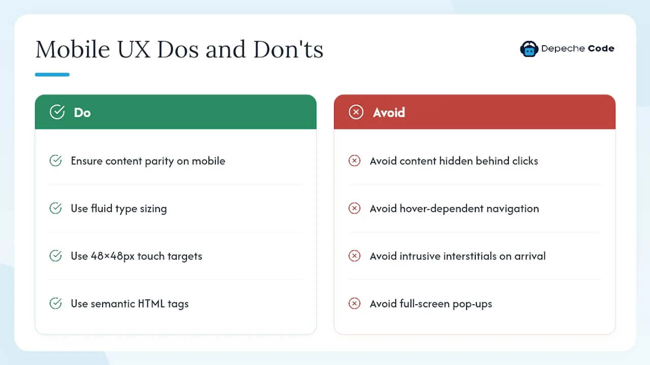
Content parity is non-negotiable. Google’s mobile-first crawler may skip or de-value content hidden behind user interactions, so accordions and tabs that require a click to expand can suppress ranking signals. Primary headings, body copy, and structured data must be present in the DOM on mobile, not loaded conditionally.
Typography and spacing. Dense text blocks that work on a 1440px monitor become unreadable walls on a 390px screen. Use clamp() for fluid type sizing so font sizes scale proportionally without hard breakpoints. Keep line lengths between 45 and 75 characters for comfortable reading. Paragraph spacing should be generous enough that users can scan without losing their place.
Tap targets and navigation. Buttons and links need a minimum touch target of 48×48 CSS pixels. Navigation patterns that rely on hover states fail entirely on touch screens. Hamburger menus are fine, but the expanded menu must be keyboard-accessible and not cover primary content. Mobile layout redesign choices here directly affect both usability and conversion rates.
Interstitials. Google penalizes intrusive interstitials on mobile pages that appear immediately after a user arrives from search. Full-screen pop-ups, large banners that push content below the fold, and standalone interstitials that require dismissal before content is accessible all violate Google’s Better Ads Standards. Small cookie notices and age-verification gates are exempt, but anything that obscures the primary content on arrival is a ranking risk.
Accessibility. Semantic HTML (<nav>, <main>, <article>, <button>) gives screen readers and search engines the same structural cues. Every image needs a descriptive alt attribute. Test with VoiceOver on iOS and TalkBack on Android to catch hidden-content issues that automated tools miss.
Common responsive implementation mistakes and how to fix them
Most responsive SEO problems fall into a handful of repeating patterns. Here is what to look for and how to fix each one fast.
- m-dot or separate mobile URLs. Running
m.example.comalongsideexample.comsplits link equity, creates redirect chains, and requires careful canonical and Vary header management. The fix is a full migration to a single responsive URL with 301 redirects from all mobile URLs to their desktop equivalents. - Hidden critical content on mobile. Content inside click-to-expand accordions or JavaScript-rendered tabs may not be indexed. Audit by fetching the mobile URL in Google Search Console’s URL Inspection tool and comparing the rendered HTML to the desktop version.
- Missing or incorrect viewport meta. Pages without the viewport tag render at desktop width on mobile, causing horizontal scroll and layout overflow. Pages with
user-scalable=nofail accessibility requirements and can trigger usability warnings in Search Console. - Images without width/height attributes. This is the single most common cause of CLS failures on responsive sites. Add explicit dimensions to every
<img>element or setaspect-ratioin CSS. - Blocking JS or CSS in robots.txt. If Googlebot cannot render your stylesheets or scripts, it cannot see your layout. Check the Coverage report in Search Console for “Blocked by robots.txt” errors on render-critical resources.
- Different structured data on mobile. If schema is injected via JavaScript that only runs on desktop, the mobile crawler sees no structured data. Test both versions in the Rich Results Test.
- Redirect loops in dynamic serving. Sites that attempt to detect user agents and serve different HTML often create redirect loops when the detection logic fails. Responsive design eliminates this risk entirely.
| Mistake | SEO impact | Fix |
|---|---|---|
| m-dot URLs | Split link equity, redirect overhead | Migrate to single responsive URL with 301s |
| Hidden mobile content | Ranking signals suppressed | Move primary content to DOM, not JS-gated |
| Missing viewport meta | Layout overflow, usability errors | Add correct viewport meta to every page |
| No image dimensions | CLS failures | Add width/height or aspect-ratio |
| Blocked render resources | Crawler cannot see layout | Remove JS/CSS blocks from robots.txt |
| Mobile-only schema gaps | No rich results on mobile | Serve identical schema in HTML |
How to test and monitor responsive SEO
Testing responsive behavior requires both lab tools and field data. Neither alone gives you the full picture.
| Tool | What it measures | When to use it |
|---|---|---|
| Google Search Console | Mobile Usability errors, Core Web Vitals field data, indexing status | Ongoing monitoring; check weekly post-launch |
| PageSpeed Insights | CWV field data (CrUX) + Lighthouse lab scores | Pre-launch baseline and post-launch tracking |
| Lighthouse | Lab performance, accessibility, best practices, SEO audit | Dev environment testing during build |
| WebPageTest | Filmstrip view, waterfall, real-device testing | Diagnosing specific LCP or CLS root causes |
| Chrome DevTools | Mobile emulation, network throttling, layout shift overlay | Developer debugging during implementation |
What to test before launch. Run Lighthouse in Chrome DevTools on the mobile preset for every key template (homepage, product, blog post, contact). Check the mobile rendering of each template in the URL Inspection tool inside Search Console. Validate structured data with the Rich Results Test using the mobile user-agent. Confirm all redirects from old URLs resolve correctly with no chains longer than one hop.
What to monitor after launch. Pull the Core Web Vitals report in Search Console daily for the first week. Watch for spikes in mobile usability errors or coverage drops. At the 7-day mark, compare organic mobile traffic to the pre-launch baseline in Google Analytics. At 30 days, run a full Lighthouse audit on the same URLs you tested pre-launch and compare scores.
Interpreting lab vs. field data. A Lighthouse score of 90 on your laptop does not mean real users are having a good experience. Field data from the Chrome UX Report reflects actual devices, actual network conditions, and actual user behavior. When lab and field scores diverge significantly, the field data is the one that matters for ranking.
Practical responsive redesign SEO checklist (pre-launch → launch → post-launch)
A responsive redesign without a structured SEO process is how sites lose 30–50% of their organic traffic in the first month after launch. Follow this checklist to protect rankings and prove improvement.
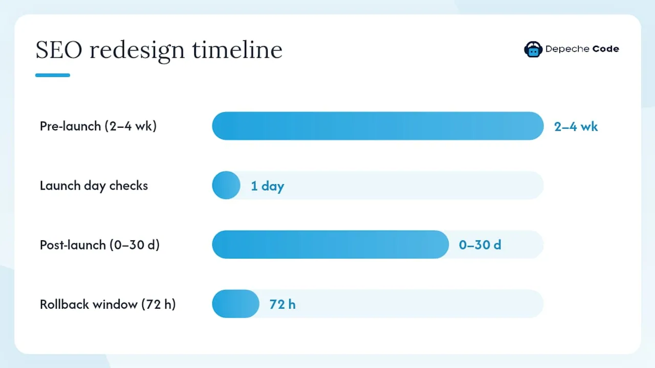
Pre-launch (2–4 weeks before go-live)
- Content inventory. Crawl the current site with Screaming Frog or a similar crawler. Document every URL, its title, meta description, H1, and inbound link count.
- Mobile content parity audit. Compare desktop and mobile rendered HTML for every key template. Flag any content, headings, or schema that appears on desktop but not mobile.
- Baseline CrUX scores. Pull field data from PageSpeed Insights for your top 20 URLs. These are your pre-launch benchmarks.
- Structured data inventory. List every schema type in use and confirm it will be present in the responsive implementation.
- Redirect map. If URLs are changing, build a complete 1:1 redirect map. Test every redirect in staging before launch.
- Staging smoke test. Run Lighthouse on the staging environment. Fix any critical issues (CLS above 0.1, LCP above 2.5 seconds, mobile usability errors) before the launch date.
Use Depechecode’s website redesign checklist as a companion document to this process.
Launch day
- Canonical and hreflang verification. Confirm canonical tags point to the correct URLs. If the site serves multiple languages, verify hreflang annotations are present and correct on mobile.
- Robots.txt and header checks. Confirm the live robots.txt does not block any render-critical resources. Check response headers for any unintended
noindexdirectives. - GSC sitemap submission. Submit the updated XML sitemap in Google Search Console immediately after launch.
- Real-device smoke test. Test the live site on at least three real devices (iOS Safari, Android Chrome, and a mid-range Android) before announcing the launch.
Post-launch (0–30 days)
- Days 1–7: daily crawl and indexing checks. Monitor Search Console for coverage errors, mobile usability issues, and any sudden drops in indexed pages.
- Week 2: traffic trend review. Compare organic sessions and impressions in Search Console to the pre-launch baseline. Segment by mobile vs. desktop.
- Day 30: full SEO regression report. Re-run Lighthouse on your baseline URLs. Compare CrUX field data to pre-launch scores. Document wins and any remaining gaps.
Pro Tip: Keep a rollback plan ready for the first 72 hours. If you see a sudden drop in indexed pages or a spike in crawl errors, the ability to revert quickly is worth more than any feature you launched. Document your pre-launch metrics so you can prove uplift, or catch a regression before it compounds.
For a deeper look at preserving rankings through a redesign, Depechecode’s guide on enhancing website redesign with SEO techniques covers the specific steps the agency uses on client projects.
Key Takeaways
Responsive web design is the single most effective SEO architecture choice for mobile-first indexing because it consolidates ranking signals, eliminates duplicate content, and aligns the crawled version with the real user experience.
| Point | Details |
|---|---|
| Single-URL architecture wins | One URL consolidates backlinks, canonicals, and structured data, removing the split-equity risk of m-dot setups. |
| Fix Core Web Vitals first | LCP, CLS, and INP failures from responsive choices (images, fonts, layout) are the fastest SEO wins to address. |
| Content parity is required | Google’s mobile-first crawler ranks the mobile version; hidden or missing content on mobile directly suppresses rankings. |
| Use field data, not just lab scores | Chrome UX Report data in PageSpeed Insights reflects real user experience and is what Google uses for ranking signals. |
| Depechecode’s checklist | The pre-launch → launch → 30-day monitoring process protects rankings and gives you measurable proof of improvement. |
The part of responsive SEO most agencies get wrong
Most guides treat responsive design as a front-end problem and SEO as a separate layer you bolt on afterward. That framing is the mistake. The decisions made during the responsive build, which images to serve, how fonts load, whether content is in the DOM or gated behind JavaScript, are SEO decisions. By the time an SEO audit happens post-launch, the structural choices that determine ranking potential are already baked in.
What actually works is treating mobile as the primary design surface from day one. Not “mobile-friendly,” which usually means “we checked it on an iPhone at the end.” Mobile-first means the base stylesheet is written for a 390px screen, the content hierarchy is defined for a small viewport, and performance budgets are set against mid-range Android hardware, not a MacBook Pro on fiber.
The other thing practitioners underestimate is the gap between lab scores and field data. A Lighthouse score of 95 in a controlled environment can coexist with a “Poor” LCP rating in the Chrome UX Report because real users are on slower networks, older devices, and have browser extensions running. Field data is the ground truth. Prioritize it.
Responsive SEO done right is not a checklist you run once. It is a monitoring discipline: baseline before launch, track the first 30 days with daily checks, and run a regression audit at the one-month mark. Sites that follow that cadence catch problems before they compound into ranking losses that take months to recover from.
Depechecode’s responsive design and SEO services
Getting a responsive site right from an SEO standpoint requires both development precision and ongoing monitoring. Depechecode, based in Orlando, delivers both under one roof, which means the team building your site is the same team tracking your Core Web Vitals and Search Console data after launch.

For businesses that need a full responsive build or redesign, the website design and development service covers architecture, performance engineering, and SEO setup from the ground up. For those who already have a responsive site and need structured monitoring and ranking improvement, the SEO options and plans include Core Web Vitals tracking, mobile usability audits, and monthly reporting against your pre-launch baseline.
The starting point for most clients is a technical audit that surfaces the highest-impact issues first, followed by a 30-day monitoring engagement to confirm the fixes held. Contact Depechecode to schedule that audit and get a clear picture of where your responsive site stands today.
Authoritative resources and tools to run tests and learn more
Use these resources to run the specific tests recommended in this guide and go deeper on any topic covered above.
- Google Search Central: Mobile-first Indexing Best Practices — the primary source for Google’s requirements on mobile content parity, structured data, and responsive configuration. Start here for any indexing question.
- PageSpeed Insights — run this on your top pages to get both Lighthouse lab scores and Chrome UX Report field data in one view. Use the field data tab for ranking-relevant signals.
- Lighthouse — available in Chrome DevTools under the “Lighthouse” tab. Set the device to “Mobile” and run audits during development to catch issues before launch.
- WebPageTest — use this when you need a filmstrip view of how the page loads on a real device, or when you need to isolate a specific LCP or CLS root cause that Lighthouse does not pinpoint.
- Chrome DevTools mobile emulation — the fastest way to check layout at specific viewport widths during development. Use the network throttling presets to simulate mid-range mobile conditions.
- MDN: Responsive Web Design — the most thorough technical reference for fluid grids, media queries, and modern responsive CSS patterns.
- Depechecode: Responsive Web Design Explained — agency-level guidance connecting responsive design decisions to SEO outcomes and business KPIs.
- Depechecode: Top 10 Mobile SEO Strategies for 2026 — a tactical companion to this guide covering mobile-specific ranking strategies beyond responsive architecture.
FAQ
Why does responsive web design help SEO?
Responsive design serves the same URL and HTML to all devices, which consolidates backlinks, canonicals, and structured data on one address. Google’s mobile-first indexing then evaluates that single mobile view for ranking, so there is no split between a desktop and mobile version of your authority.
What is the 80/20 rule in SEO?
The principle in SEO holds that a minority of your pages and technical fixes drive the majority of your organic traffic gains. For responsive sites, that typically means fixing Core Web Vitals failures and content parity issues on your highest-traffic templates before addressing lower-priority pages.
What does a responsive website look like in practice?
A responsive site uses one URL that adapts its layout via CSS. On a phone, a three-column product grid collapses to a single column; navigation shifts to a hamburger menu; images resize to fit the viewport. The URL, HTML content, and structured data stay identical across every screen size.
What are the four types of SEO?
The four commonly recognized types are on-page SEO (content, headings, meta tags), technical SEO (site architecture, crawlability, Core Web Vitals), off-page SEO (backlinks, authority signals), and local SEO (Google Business Profile, location-based signals). Responsive design primarily affects technical SEO but has downstream effects on all four by improving crawlability, user experience, and engagement signals.
How do I check if my responsive site has mobile SEO issues?
Open Google Search Console, go to the “Mobile Usability” report under Experience, and review any flagged errors. Then run your key URLs through PageSpeed Insights and check the Core Web Vitals field data section. Those two checks will surface the issues with the most direct ranking impact.