

UI design turns product functionality into usable, trust-building interfaces that real people actually want to use. Without it, even technically sound code produces products that frustrate users, inflate support costs, and stall conversion.
Two outcomes matter most to development teams:
- Technical: Clear UI artifacts (wireframes, component specs, design tokens) reduce ambiguity during implementation and cut QA cycles by catching edge cases before a single line of code is written.
- Business: Good UI directly affects conversion rates, user retention, and brand credibility — the metrics that determine whether a product survives its first year.
A well-executed UI reduces user churn and increases engagement by creating an emotionally credible product surface. That is not a soft benefit. It is the difference between a product people return to and one they abandon after one session.
Table of Contents
- What UI design is and how it differs from UX
- Why UI design matters in product development
- What deliverables UI designers produce for development
- How UI design fits into development workflows
- Principles of effective UI that developers should care about
- How UI work reduces risk, cost, and time-to-market
- Practical checklist for developer-designer collaboration
- How Depechecode integrates UI design into development
- Next steps: how to introduce better UI design into your project
- Key Takeaways
- The part most teams get wrong about UI design
- Depechecode builds UI-first digital products that ship on time
- FAQ
- Useful sources and further reading
What UI design is and how it differs from UX
User interface (UI) design is the practice of crafting the visual and interactive layer of a digital product: the colors, typography, buttons, icons, spacing, and motion that users see and touch. As the Interaction Design Foundation defines it, UI design focuses on looks and style, aiming to create interfaces users find easy to use and pleasurable.
UX design is the broader discipline. It covers the entire user journey, from research and information architecture to task flows and usability testing. UI design is where that strategy becomes visible.
UI is to UX what the driving console is to the car. UX defines how the vehicle works and where it goes; UI is every button, dial, and display the driver actually touches. A car with a bad dashboard is dangerous regardless of how well-engineered the engine is.
For development teams, the practical split looks like this:
| Responsibility | UX Designer | UI Designer |
|---|---|---|
| User research and personas | ✓ | Sometimes |
| Information architecture | ✓ | Rarely |
| Wireframes | ✓ | Refines |
| High-fidelity visual comps | Rarely | ✓ |
| Interactive prototypes | Sometimes | ✓ |
| Component specs and tokens | Rarely | ✓ |
| Accessibility annotations | Shared | ✓ |
Developers most often receive UI deliverables: Figma files, component libraries, design tokens, and annotated specs. Understanding that these come from UI work, not UX research, helps teams ask the right person the right question during a sprint.
Why UI design matters in product development
The impact of UI on user experience is measurable at every stage of the product lifecycle. Here is where it shows up most clearly:
- Usability: Clear visual hierarchy and intuitive UI improve user flows and make conversion funnels more effective. Users complete tasks faster when the interface does not make them think.
- Conversion: Layout decisions, button placement, and CTA clarity directly affect whether a visitor becomes a customer. Web design choices from layout hierarchy to load times impact bounce rates and conversion paths.
- Brand trust: A buggy or visually inconsistent interface breaks user confidence faster than almost any other product failure. As GeeksforGeeks notes, even a single interface bug can destroy a user’s trust regardless of how good the underlying product is.
- Reduced support load: When navigation is obvious and error states are clearly communicated, users solve their own problems. Fewer confused users means fewer support tickets.
- Faster onboarding: New users orient themselves through visual cues. Strong UI reduces the learning curve without requiring a tutorial.
One angle developers often overlook: good UI also reduces technical debt. When a design system is established early, engineers stop making ad hoc visual decisions in code. Those improvised decisions accumulate into inconsistencies that are expensive to untangle later.
The importance of UI design extends to how features are perceived. A feature that works perfectly but looks broken will be reported as broken. UI is not decoration applied after engineering. It is part of what makes the feature real.

What deliverables UI designers produce for development
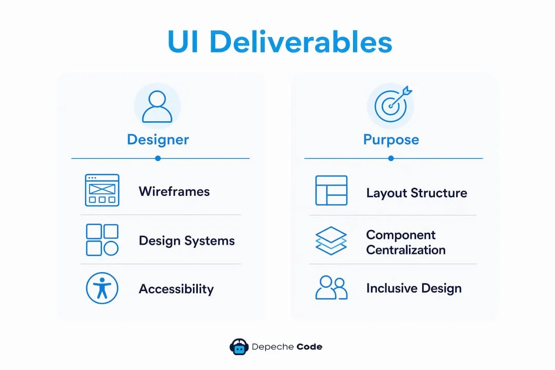
Developers and PMs should expect a specific set of artifacts from UI design. Each one serves a different purpose in the build process.
| Deliverable | Purpose | Typical Format | Reduces Ambiguity For |
|---|---|---|---|
| Wireframes | Layout structure and content hierarchy | Figma, Sketch, PDF | Engineers, PMs |
| High-fidelity visual comps | Exact visual specification | Figma frames | Engineers, QA |
| Interactive prototypes | Flow and interaction testing | Figma prototype, InVision | QA, stakeholders |
| Design tokens | Color, spacing, type values in code-ready format | JSON, CSS variables | Engineers |
| Component library | Reusable UI patterns with states | Figma library, Storybook | Engineers, QA |
| Accessibility annotations | ARIA labels, focus order, contrast ratios | Figma annotations | Engineers, QA |
| Design specs | Measurements, breakpoints, animation easing | Figma Inspect, Zeplin | Engineers |
Design systems centralize tokens, components, and documentation, reducing duplicated effort and speeding developer handoff. A component library in Storybook, for example, lets engineers reference live component states without going back to the designer for every edge case.
Pro Tip: Ask your UI designer to annotate every interactive state in the comp, not just the default. Hover, focus, error, loading, empty, and disabled states are where most implementation bugs originate.
The most underused deliverable is the accessibility annotation. When ARIA roles, focus order, and color contrast requirements are documented in the Figma file, engineers do not have to guess, and QA has a clear acceptance standard.
How UI design fits into development workflows
UI design does not happen in a single phase. It runs in parallel with development, with distinct touchpoints at each stage of the workflow.
Where UI work happens:
- Discovery: UI designers participate in stakeholder interviews and competitive analysis. They produce early sketches and mood boards that align the team on visual direction before wireframes begin.
- Sprint planning: UI work is scoped and sequenced one to two sprints ahead of engineering. Designers hand off specs for the features engineers will build next sprint, not the current one.
- Design iteration: Feedback from engineering (“this animation is too expensive to implement”) loops back into the design. Iteration happens in Figma before it happens in code.
- Final handoff: Designers publish a Figma file with Inspect mode enabled, export tokens, and link to the Storybook component library. Engineers pull specs directly without a meeting.
- Post-launch: UI designers review production builds against comps, log visual discrepancies, and prioritize polish fixes for the next sprint.
The typical workflow runs: research → wireframes → prototypes → testing → handoff. Strong communication and shared artifacts at each transition speed implementation and reduce the back-and-forth that kills sprint velocity.
Concrete handoff artifacts engineers need at the start of implementation:
- Token mapping (color, spacing, type scales in the codebase’s format)
- Responsive breakpoints with layout behavior at each size
- All interactive states annotated (hover, active, focus, error, disabled)
- Animation specs (easing curves, duration, trigger conditions)
- Accessible color contrast ratios and ARIA annotation notes
Pro Tip: Run a 30-minute handoff review with the lead engineer before any sprint where new UI components are introduced. Walk through the Figma file together. Questions that surface in that meeting would otherwise become Slack threads mid-sprint.

Principles of effective UI that developers should care about
Developers who understand UI principles make better implementation decisions. They know which visual details are negotiable and which ones break the product if compromised.
The best interfaces are invisible. Users reach their goals without thinking about the interface itself. Consistency and simplicity reduce cognitive load to the point where the UI disappears from conscious attention. That is the standard worth building to.
Consistency means every button, label, and interaction pattern behaves the same way across the product. For developers, this translates to using the design system’s components rather than writing one-off styles. Inconsistency in the UI reads as a bug to users, even when the underlying logic is correct.
Visual hierarchy guides the user’s eye to what matters most. Engineers preserve hierarchy by respecting the type scale and spacing system in the design tokens. Overriding a heading size to “make it fit” collapses the hierarchy the designer built.
Simplicity is not about fewer features. It is about reducing the number of decisions a user has to make. From a development perspective, this means resisting the urge to surface every option in the UI. Default states should handle 80% of cases.
Responsiveness requires that layout behavior is defined at every breakpoint, not just desktop and mobile. Web design decisions from layout hierarchy to load times affect search visibility and conversion, so responsive implementation is both a UX and an SEO concern.
Accessibility is where UI principles meet legal and ethical obligations. UI design standards like ISO 9241 and Nielsen Norman’s usability heuristics provide testable criteria for inspection and QA. WCAG 2.1 AA is the baseline for most US digital products. Engineers who implement ARIA patterns correctly, maintain keyboard navigation, and respect focus order are doing UI work, whether they call it that or not.
How UI work reduces risk, cost, and time-to-market
The financial case for investing in UI design early is straightforward: finding a problem in a Figma prototype costs a fraction of finding it in production code.
Interactive prototypes allow teams to test flows and discover issues early, reducing late-stage rework and buggy releases. A usability issue caught during prototype testing might take two hours to fix in Figma. The same issue caught during QA requires a developer to rework the component, a designer to re-review, and QA to retest. The cost multiplies at each stage.
Sample timeline for a mid-size feature (e.g., a checkout flow redesign):
| Phase | Duration | UI Design Activity |
|---|---|---|
| Discovery | 1 week | Stakeholder interviews, competitive review, flow mapping |
| Wireframes | 1 week | Low-fidelity layout, content hierarchy |
| Visual comps | 1–2 weeks | High-fidelity screens, all states |
| Prototype and testing | 1 week | Clickable prototype, 5-user usability test |
| Handoff | 2–3 days | Figma Inspect, tokens, Storybook links |
| Implementation | 2–3 weeks | Engineering builds from specs |
| Polish and QA | 3–5 days | Visual QA, discrepancy fixes |
UI design work typically runs 15–25% of total project effort on a feature of this size. That investment consistently reduces implementation time because engineers spend less time making visual decisions and less time reworking components after stakeholder reviews.
The business effects of strong UI compound over time. Products with clear CTAs and hierarchy convert better, retain users longer, and generate less support overhead. Those outcomes show up in revenue, not just in user satisfaction scores.
Practical checklist for developer-designer collaboration
Use this checklist at handoff and during the build to catch the issues that cause the most rework.
Before handoff (designer confirms):
- All screens cover every interactive state: default, hover, focus, active, error, loading, empty, disabled.
- Responsive behavior is defined at all breakpoints (typically 320px, 768px, 1024px, 1440px).
- Accessibility annotations are complete: ARIA roles, focus order, color contrast ratios.
- Design tokens are exported and named to match the codebase’s naming convention.
- Component library is published and linked in the handoff file.
- Animation specs include easing, duration, and trigger conditions.
- Edge cases are documented: long text strings, missing images, zero-state screens.
During implementation (developer confirms):
- Token values are pulled from the design system, not hardcoded.
- Component props match the states defined in the Figma file.
- Keyboard navigation works on all interactive elements.
- Error states display the correct copy and visual treatment.
- Animation easing matches the spec (check in browser dev tools).
QA acceptance (QA confirms against UI deliverables):
- Production build matches the high-fidelity comp at each breakpoint.
- All interactive states render correctly.
- Screen reader announces elements in the correct order.
- Color contrast passes WCAG 2.1 AA on all text and UI components.
- No hardcoded styles override design tokens.
This checklist works best when it lives in your project management tool (Jira, Linear, Notion) as a reusable template attached to every UI-heavy ticket.
How Depechecode integrates UI design into development
At Depechecode, UI design is not a handoff that happens once. It is a continuous thread through every phase of a project.
The sequence starts with discovery: a structured session where designers, developers, and the client align on goals, user needs, and technical constraints before any visual work begins. Wireframes follow, reviewed jointly by design and engineering to catch layout decisions that would be expensive to implement. High-fidelity comps are built in Figma with a shared component library that engineers can inspect directly, no translation layer required.
Treating UI as a development input, not a design output, is what separates fast-shipping teams from ones stuck in revision cycles. When engineers and designers share the same component library and token set from day one, the gap between the comp and the production build shrinks to almost nothing.
Depechecode maintains a centralized design system for each client engagement, with versioned components and documented states. QA sign-offs reference the Figma file directly, so there is no ambiguity about what “correct” looks like. Post-launch, the team runs a visual QA pass against the production build and logs discrepancies before the client ever sees them.
The result is fewer revision rounds, shorter QA cycles, and products that look and behave exactly as designed. For clients building mobile apps or complex web products, that consistency is what makes the difference between a launch and a relaunch.
Next steps: how to introduce better UI design into your project
If your current process treats UI design as something that happens before development starts and never again, these steps will change that.
- Schedule a joint handoff review before any sprint where new UI components are introduced. Thirty minutes with the designer and lead engineer prevents hours of back-and-forth later.
- Create a lightweight component checklist for your project: list every component in the design system, its states, and its token dependencies. Attach it to every implementation ticket.
- Add accessibility tests to your QA suite. Tools like Axe or Lighthouse flag contrast failures, missing ARIA labels, and keyboard traps automatically. Run them on every PR.
- Adopt a shared token file. If designers are using one set of color names and engineers are using another, you will have visual inconsistencies in production. Align on a single source of truth, whether that is a Figma token plugin or a JSON file in the repo.
- Run a one-hour cross-functional design review before sprint planning. Show the comps, walk through edge cases, and let engineers flag implementation concerns before the sprint starts. This single habit eliminates most mid-sprint design questions.
- Review the UX design process your team uses and identify where UI work currently enters. If it enters after sprint planning, move it one sprint earlier.
Key Takeaways
UI design in development is not a finishing step. It is a structural input that determines how fast teams ship, how few bugs reach production, and whether users trust the product enough to stay.
| Point | Details |
|---|---|
| UI vs. UX distinction | UI produces the visual and interactive layer; UX defines the strategy. Developers receive UI artifacts: comps, tokens, and component specs. |
| Core deliverables | Wireframes, high-fidelity comps, interactive prototypes, design tokens, component libraries, and accessibility annotations each reduce implementation ambiguity. |
| Early investment pays off | A usability issue caught in a prototype costs a fraction of the same issue found during QA or after launch. |
| Principles developers must preserve | Consistency, visual hierarchy, responsiveness, and accessibility are not aesthetic preferences — they are functional requirements. |
| Depechecode approach | Depechecode integrates UI design as a continuous thread through discovery, handoff, implementation, and post-launch QA for faster delivery and fewer revisions. |
The part most teams get wrong about UI design
The most common mistake is treating UI design as a phase rather than a practice. Teams schedule “the design phase,” hand off a Figma file, and expect engineering to handle everything from there. What actually happens: engineers make dozens of small visual decisions the designer never specified, QA flags them all, and the team spends the last week of a sprint on visual fixes that should have been resolved in a 30-minute conversation.
The second mistake is separating UI from accessibility. Accessibility is not a checklist item you add at the end. It is a design constraint that shapes every component from the first wireframe. When it is retrofitted, it is expensive. When it is designed in, it is nearly free.
If I were starting a new project tomorrow, here is what I would do first: establish a shared token file before any visual design begins, run a joint handoff review at the start of every sprint with new UI work, and add automated accessibility tests to the CI pipeline on day one. Those three habits eliminate the majority of UI-related rework before it starts.
Depechecode builds UI-first digital products that ship on time
Most agencies hand you a design file and leave the integration to your team. Depechecode does the opposite: UI design and development run as a single, coordinated process from discovery through launch, with shared component libraries, documented handoffs, and QA that references the Figma comp directly.
The result is fewer revision rounds and a production build that matches the design. Whether you are building a new website or a mobile app, Depechecode’s Orlando-based team handles the full cycle, from wireframes to post-launch polish, without the back-and-forth that inflates timelines.
Ready to see how it works? Explore Depechecode’s website design and development service and book a discovery call to review your next project.
FAQ
What is the main purpose of UI design in software development?
UI design translates product functionality into a visual and interactive layer that users can navigate intuitively. It produces the artifacts (comps, tokens, component specs) that engineers implement, reducing ambiguity and rework throughout the build.
What are the three core roles of a UI designer on a development team?
A UI designer defines the visual system (colors, typography, spacing), produces implementation-ready artifacts (high-fidelity comps, design tokens, component libraries), and validates the production build against the original design to catch discrepancies before launch.
How does UI design differ from UI development?
UI design is the practice of specifying what the interface looks like and how it behaves, typically in tools like Figma. UI development (or front-end development) is the act of building that specification in code using HTML, CSS, and JavaScript. Designers define the intent; developers implement it.
What is the role of UI/UX design in product development?
UX design maps the user journey and defines what the product needs to do. UI design makes that strategy visible and interactive. Together, they determine whether a product is both usable and appealing, which directly affects retention, conversion, and user trust.
Does UI design require coding skills?
UI design does not require coding, since the focus is on layout, color, typography, and interaction patterns. That said, a working knowledge of HTML, CSS, and JavaScript helps UI designers communicate more precisely with developers and understand what is feasible to implement.
Useful sources and further reading
- What Is UI Design? — Figma Resource Library: Covers UI principles, the relationship between UI and UX, and how design systems support developer handoff.
- What Is UI Design and Why Is It Important? — Sketch Blog: Practical overview of UI deliverables, the role of prototypes, and the business case for investing in UI work.
- User Interface Design — Wikipedia: Reference for UI standards including ISO 9241 and Nielsen Norman heuristics used in usability inspection and QA.
- Why Is Web Design Important? — Shopify: Data-backed look at how design decisions affect SEO, bounce rates, and conversion paths.
- The Role of UX/UI in Web Development — Ironhack Blog: Explains the research-to-handoff workflow and how shared artifacts speed implementation.
- What Is User Interface (UI) Design? — IxDF: Comprehensive definition of UI design, its scope, and how it differs from graphic design and UX.
- Mobile App UX Tips That Drive Real User Engagement — Depechecode: Practical guidance on applying UI and UX principles to mobile products for better post-launch engagement.